52 Weeks of Inspiring Illustrations, Week 46: A Marriage of Convenience — The Half-Tone Relief Process
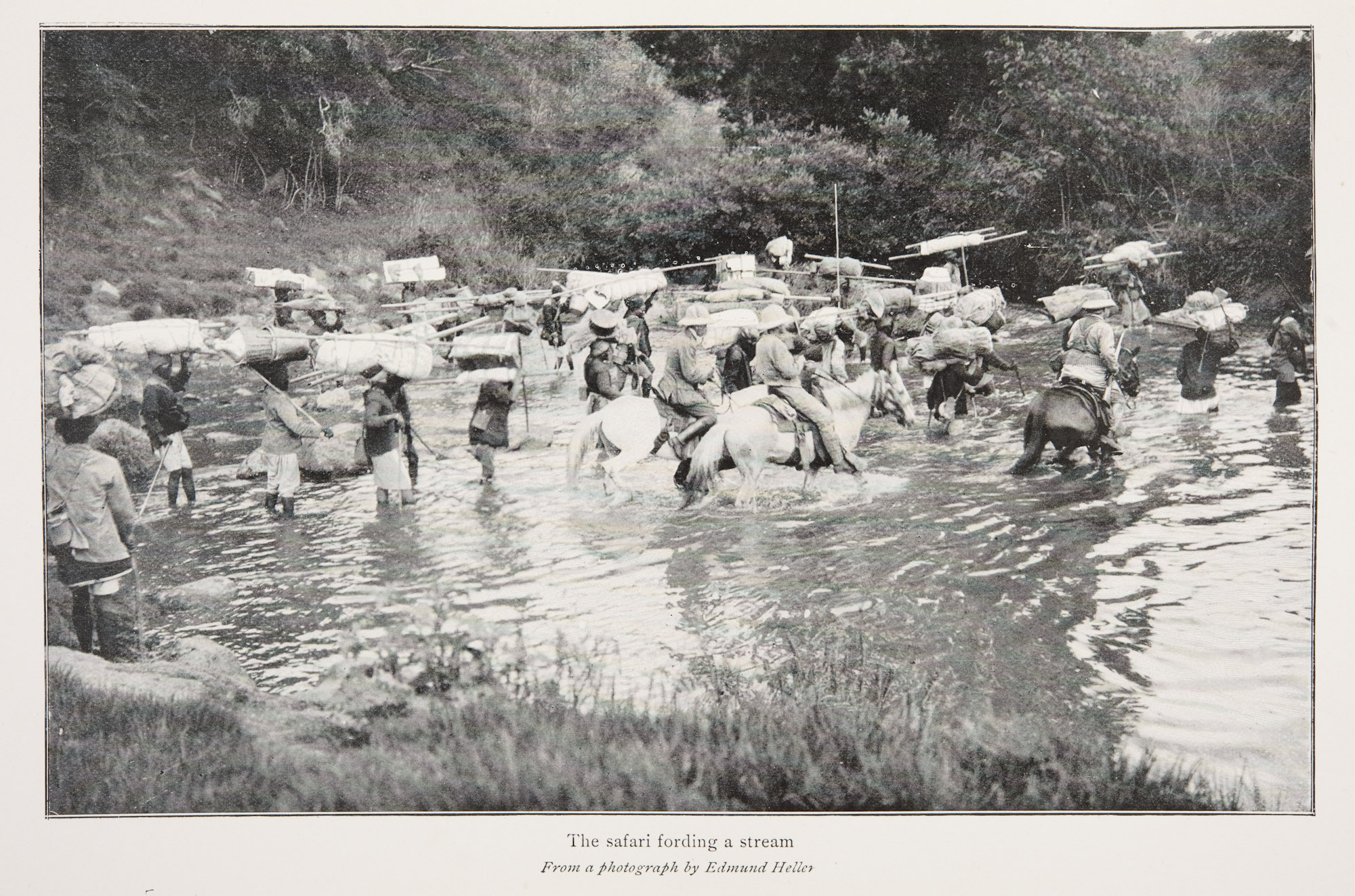
At its core the reproduction of the printed word is usually a process which is based on relief printing. Historically (as things are now different), a cast piece of type when it is set for printing, has the shape of the letter standing proud of the printing block which is subsequently inked and impressed onto a page. The ink that was on the face of the letter is transferred on the paper, and, since it is sitting proud, the entire area around the letter is free of ink and creates a blank space until the next letter. What had tormented book publishers since the invention of the Gutenberg press was the technical need to discover “typographically compatible illustration media”.
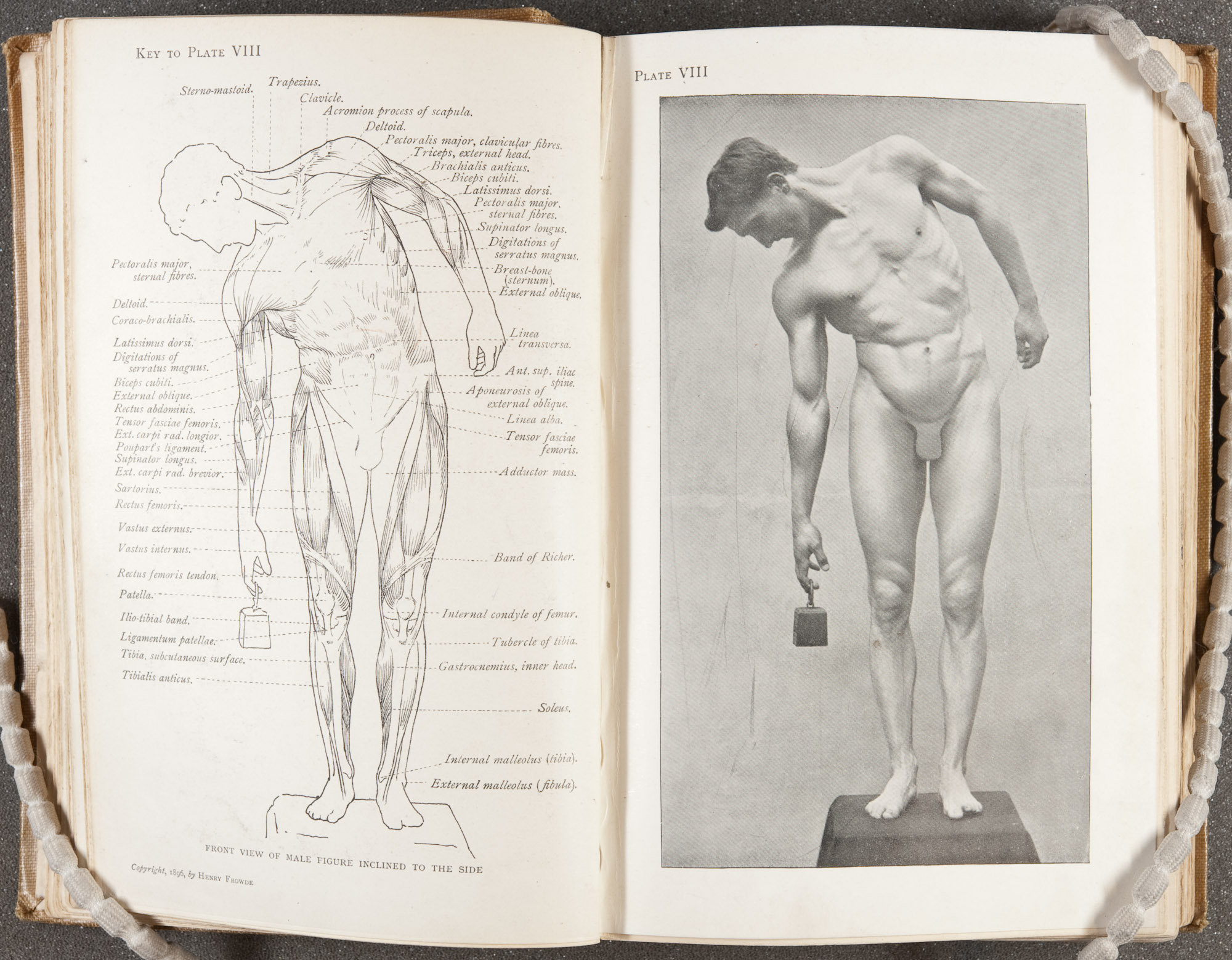
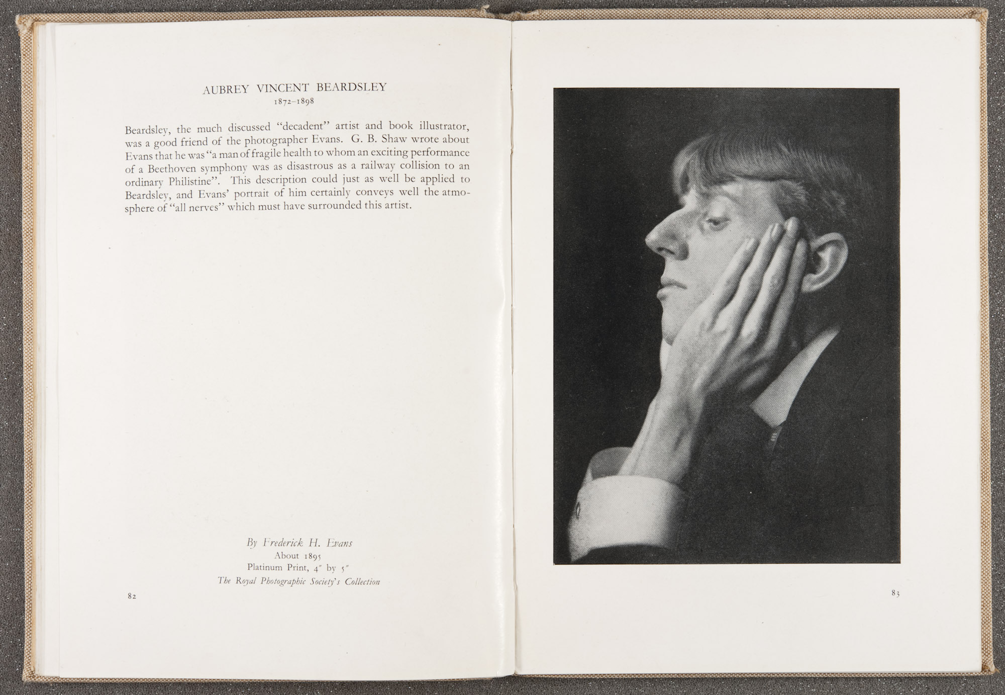
In the 19th and 20th century this printing standard continued to present logistical issues for publishers who wanted to include photography in their publications. Photographs due to their many different shades and tones are best reproduced using intaglio or planographic processes. The difficulty lies in that relief processes cannot effectively be printed at the same time as intaglio or planographic ones. Intaglio printing, such as the photogravure ,uses channels etched into a plate to hold ink which is the exact opposite of relief printing. Planographic printing, such as the bromoil or the collotype, uses the properties of oil and water to repel one another to render its images onto paper.
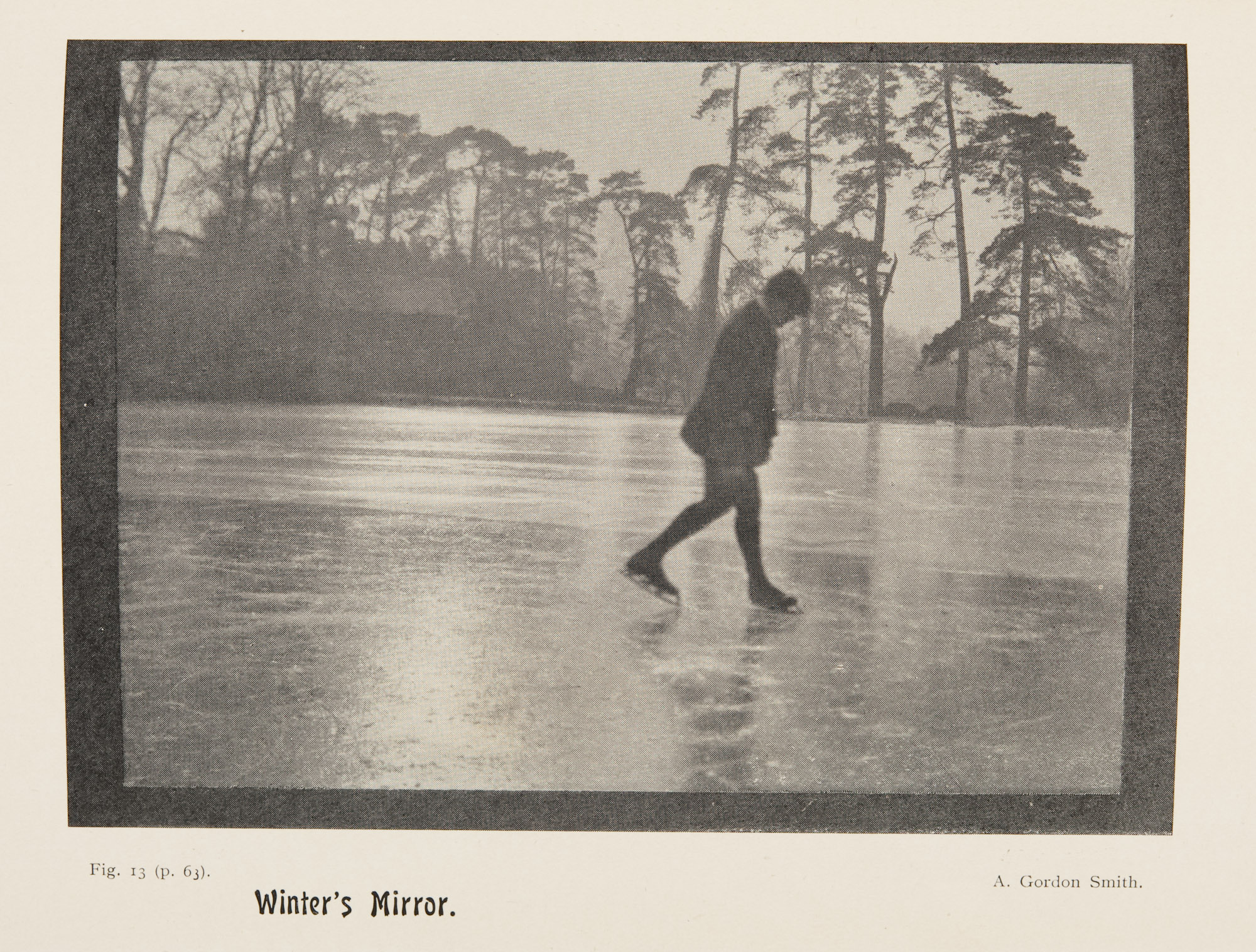
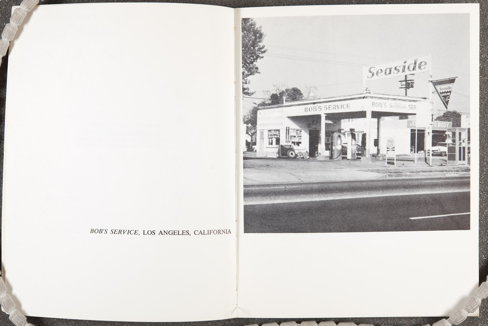
For an early book publisher to make use of a photograph, they had one of three choices. The first was to trim and mount an image on to the book pages, creating more work, slowing down the process, and creating more expense for the publisher. The second was to treat the image as a foreign body and have it grafted onto the structure of the binding, which was also labour intensive. Thirdly, the print could be copied in some graphic medium which could be printed simultaneously with the metal type, but which could also render adequate images on the text stock paper selected for a specific publication.
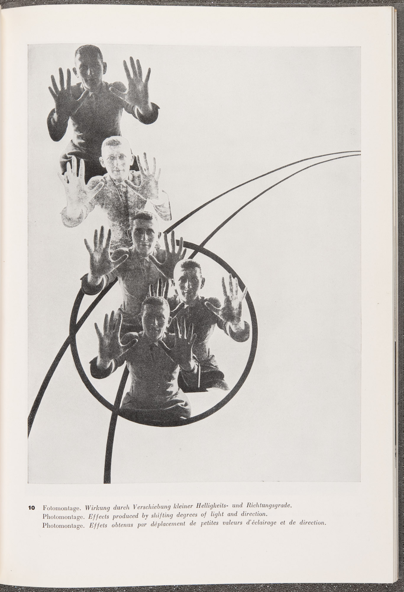
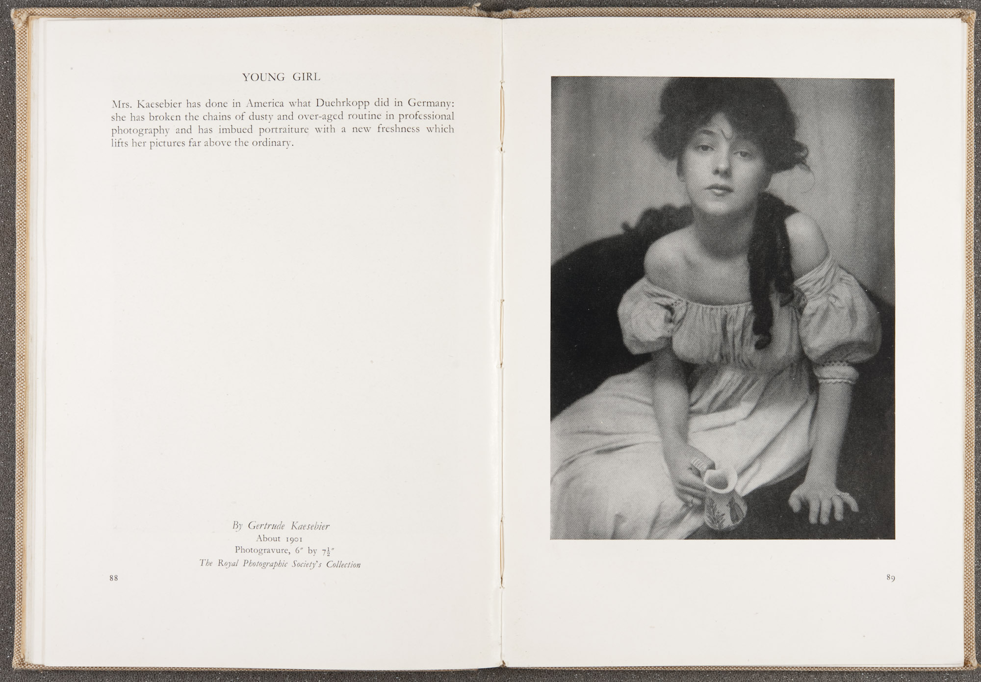
The half-tone relief process is the medium which most closely realised the need of the printing industry to combine the printing of both type and image. Its invention can be attributed to Frederick Eugene Ives in August of 1881. Well in use from the 1880s to the 1950s the half-tone process was referred to as the Block Process, Half-tone Engraving, Half-tone letterpress and the typographic press. One will note the clear reference to type based processes in almost all the names. As this was its original purpose, this process was designed to work in concert with letterpress printing machines since these were the devices which drove the publishing industry.
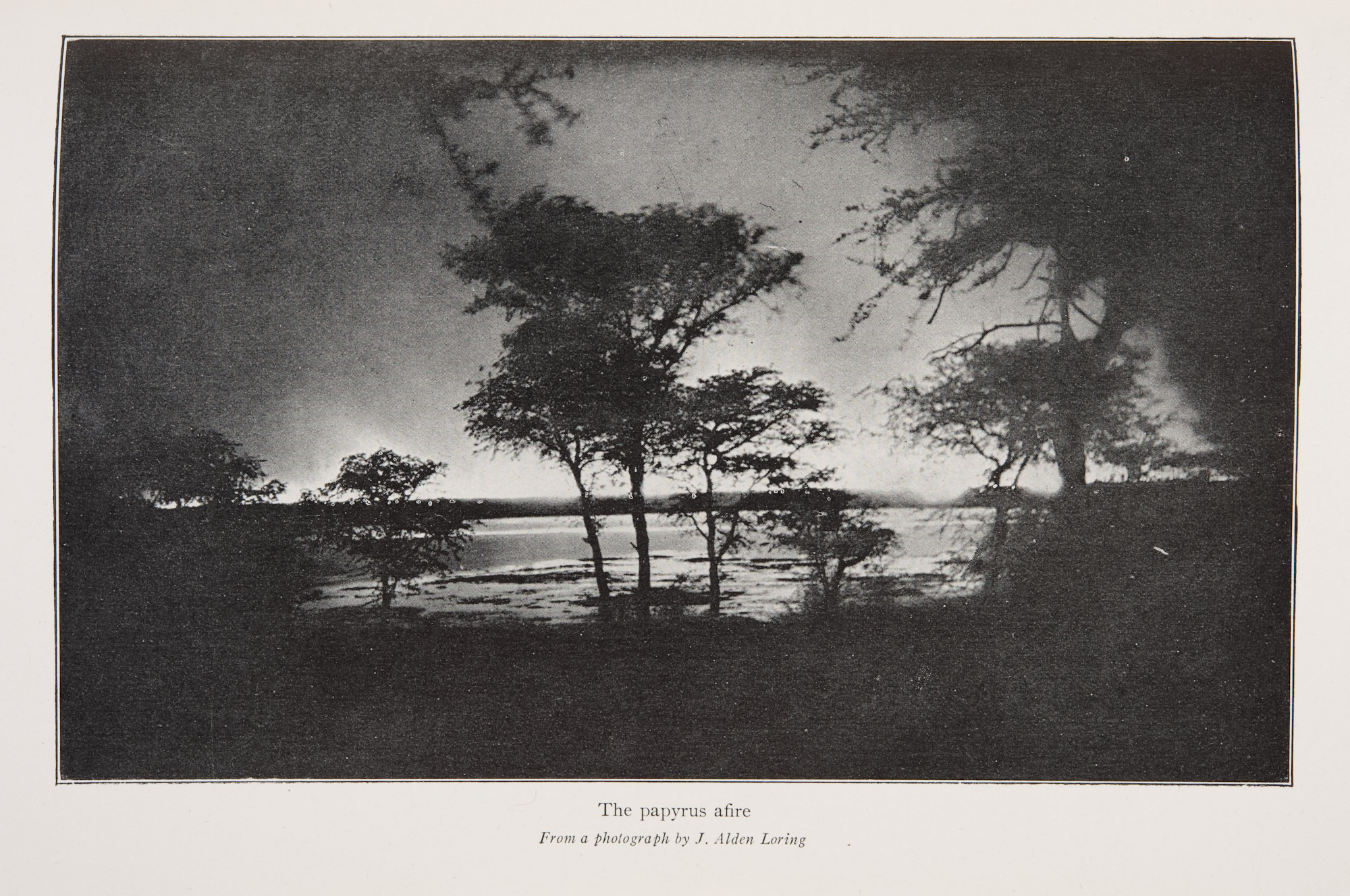
The advancement that made a printing process compatible with text type was the development of image channels of dots which were not of differing intensity or tone, but of differing size of the same tone, giving the optical illusion of grey values (see detail below). This was achieved chiefly through the application of a printing screenin the manufacturing of the copy negative. The printing screen as we know it today was first developed in Munich in 1882 by George Meisenbach as the “single line screen”, and then further developed into the “double line screen” in 1886, the year the process was publicly announced.
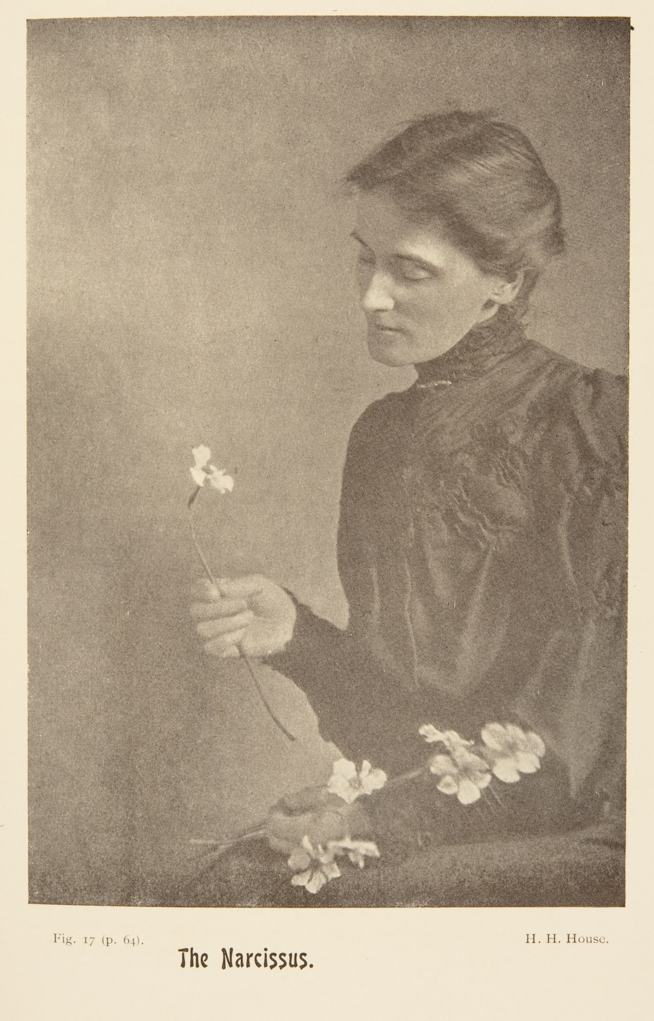
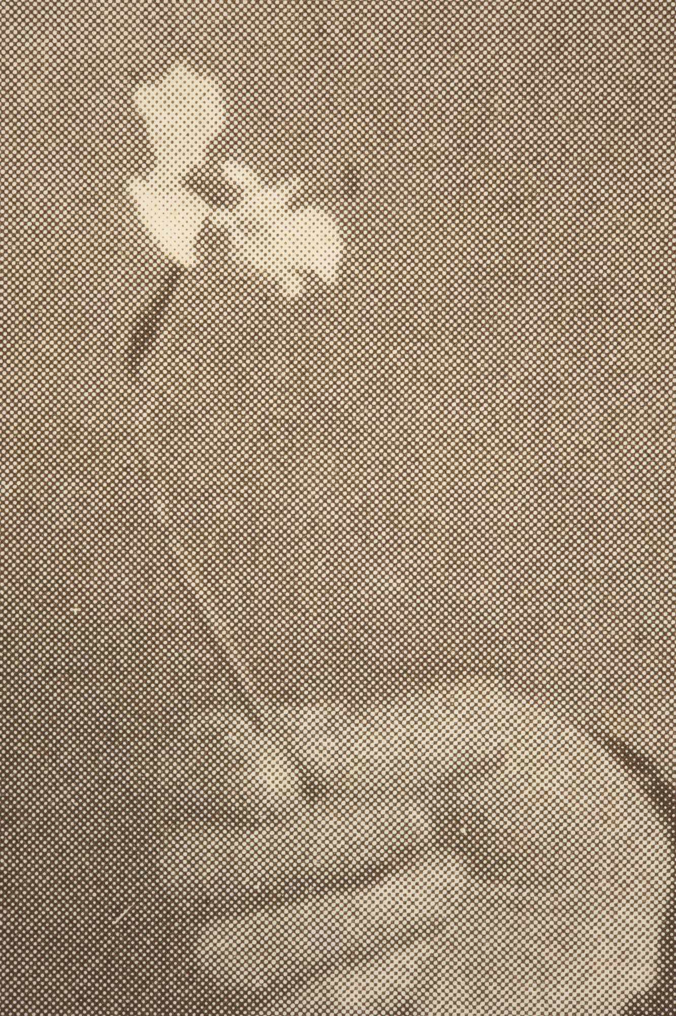
It was found that by placing a screen, or “grating” as it was called at the time, over an image a little distance in front of the picture, that a curious optical effect took place — the darker parts of the image were rendered as larger black squares, whereas lighter parts of the image were rendered as smaller black squares of the same intensity. It resulted in what was a crude “code” for the transmission of information, but it was far more compatible with the printing of text than anything else, and would be slowly refined over the years.
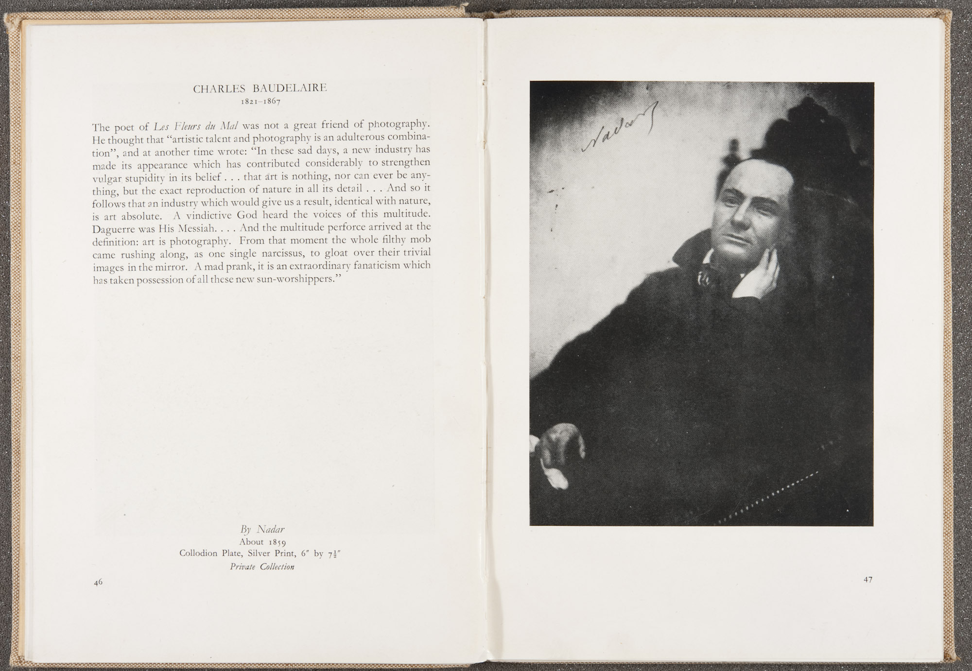
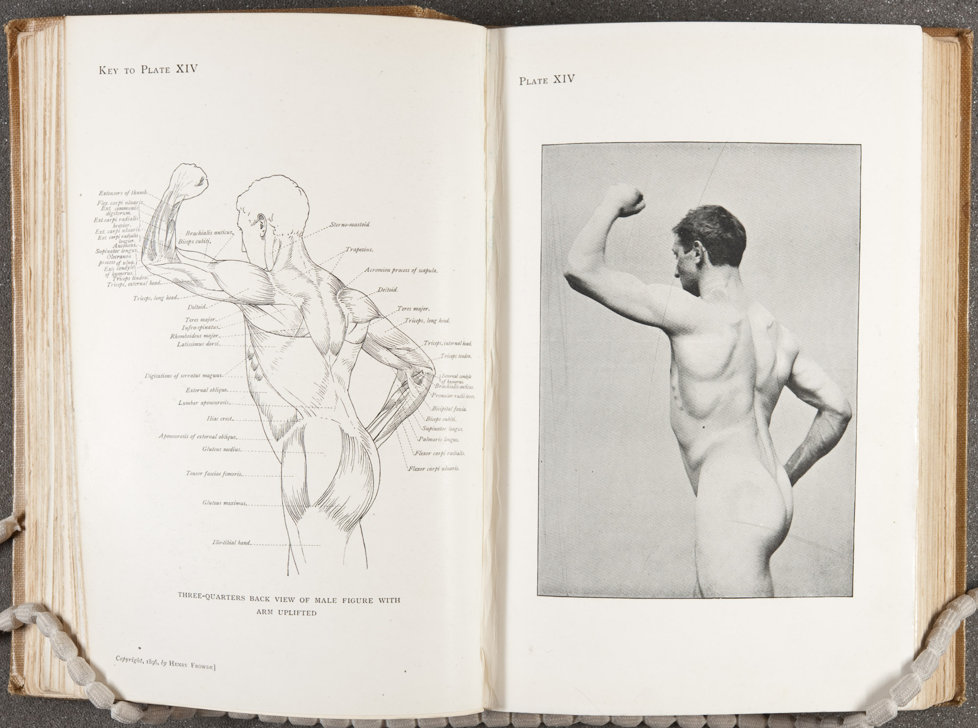
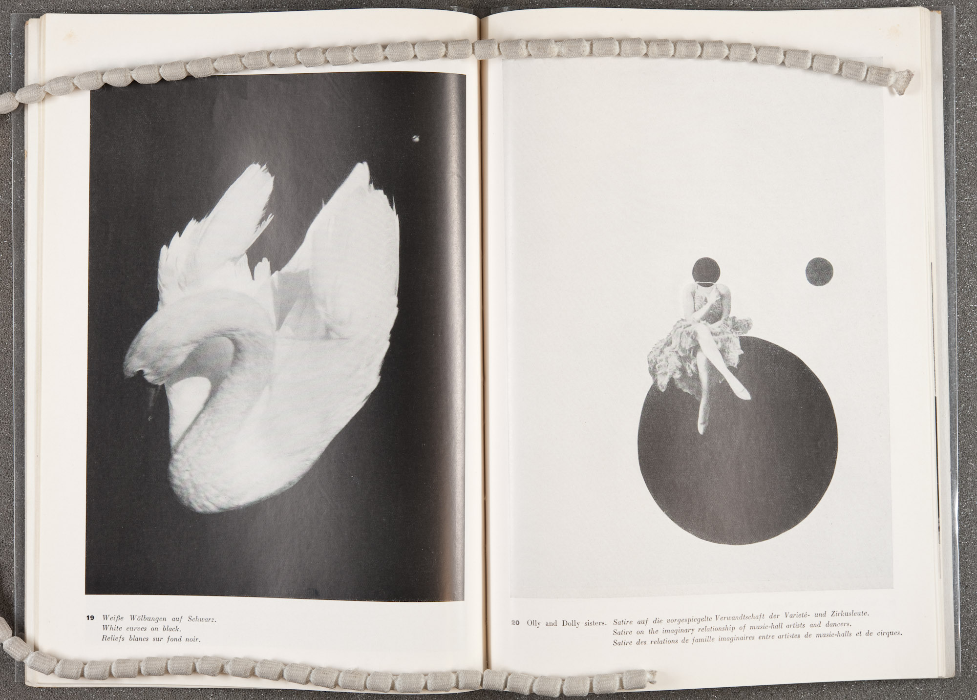
Although this sounds great in theory, there still remained complications, which arose from the nature of both the typographic and half-screen print. Firstly, there is the very important issue that pictures don’t necessarily print well on the same kind of paper stock which is advantageous to text based printing. On top of this, the amount of pressure required to make a good impression on paper differs from text to image. It would come to the point where publishers found that the type of paper used was so crucial that they had to resort to printing fine screen plates on a different paper stock, thus bringing them back to the same problem of incompatibility they had faced in the beginning. Their only solutions were to print their images on highly calendered paper, which again would require the extra work of collating the prints into the binding, or to print the entire publication on glossier paper stock which rendered beautiful images, but was reflective, difficult to read, more expensive, and less durable. Examples of such printing are seen every day in our glossy magazines which put a premium on images. The last available solution was to use coarser screens such as those historically used in newspapers, as these would be able to withstand the harsh printing, but reduce the perceived level of detail and tonality from the final image.
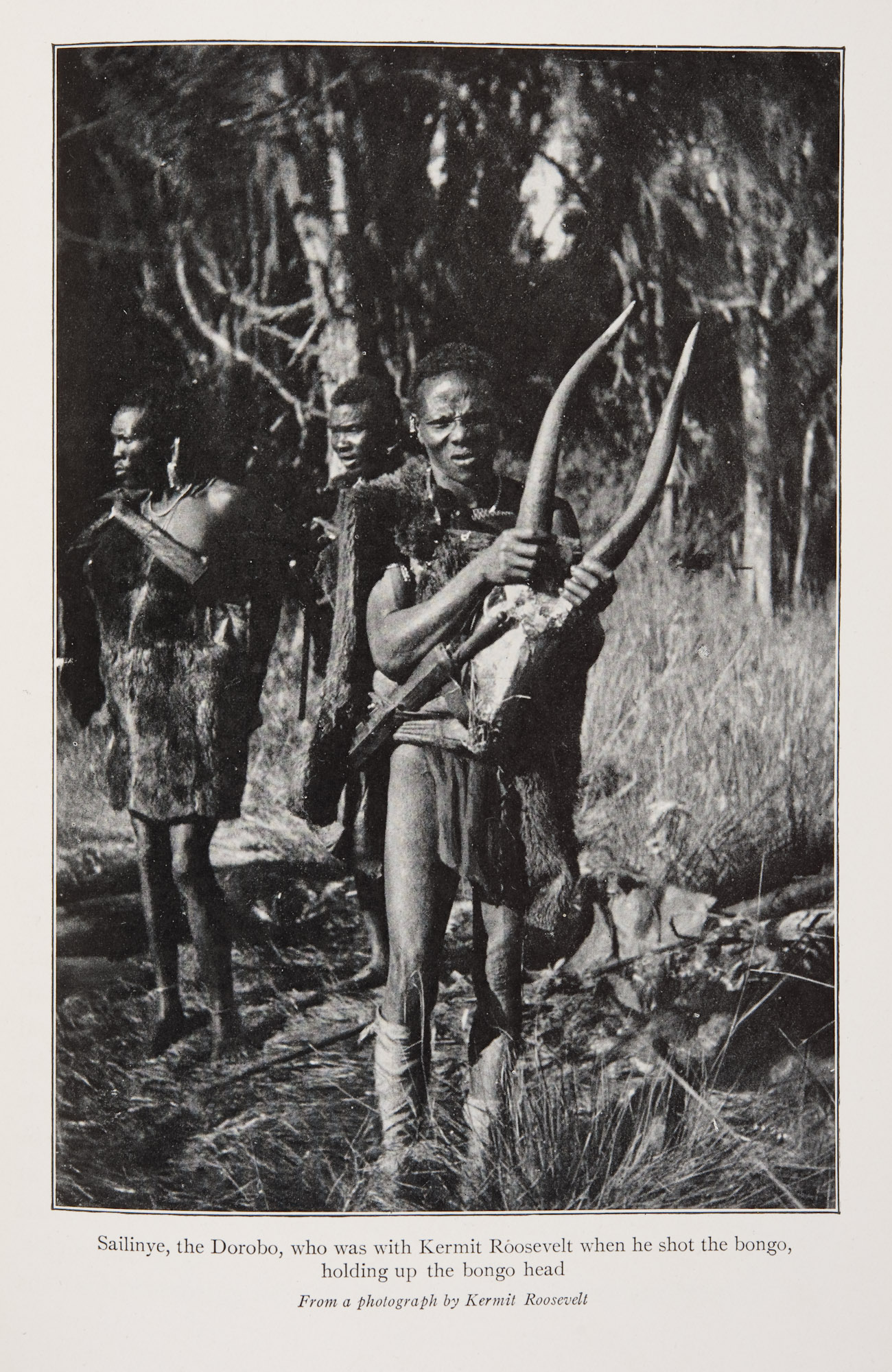
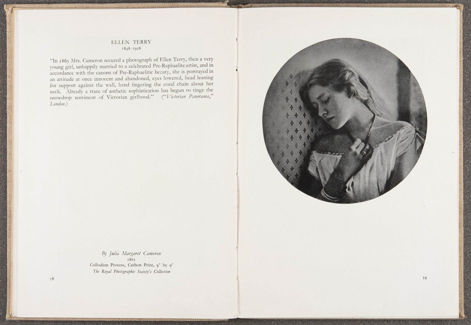
Regardless of its myriad of issues in terms of production and quality, the role of half-tone printing in the history of photography cannot be overstated. It is thanks to the half-tone relief process that photographic books, newspapers, leaflets and periodicals have been made cost effective to produce and distribute, thus democratising the communication of visual information. In the 20th century it has been the great equaliser of image based publishing. Without it, artists, educators, politicians, propagandists, students, authors, scientists, and those from all walks of life who rely on the power of the photograph to further their objectives, would not have had the ability to communicate their work to consumers of visual information the world over.
–MB