Reading the collections, Week 46: Math becomes art in Byrne’s 1847 colourful Euclid
Amongst the stacks in St Andrews one can find some of the most stunning and renowned examples of mathematicians and artists collaborating or crossing boundaries to experiment largely with Euclid’s Elements and their complex problems, theorems and solutions: Luca Pacioli’s edition of Euclid and his collaboration with da Vinci in his Divina proportione, Apollonius’s Conics, Oronce Finé’s De mundi sphaera, &c., &c.
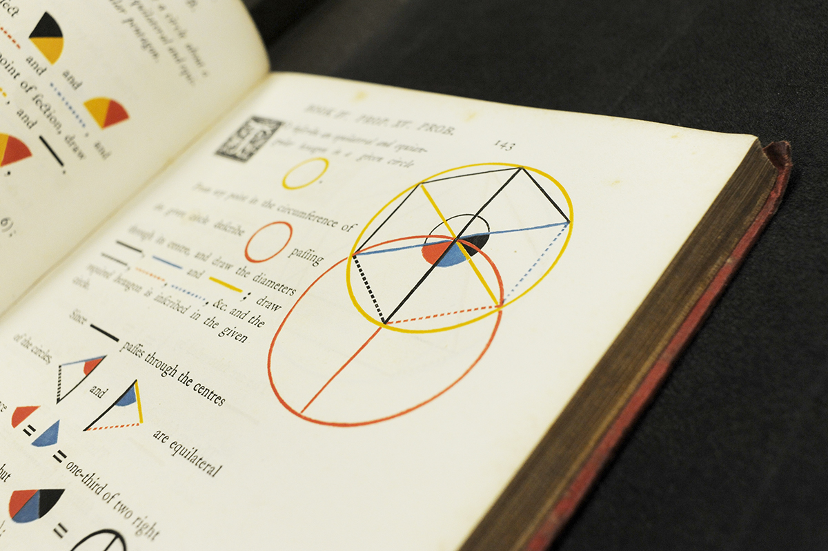
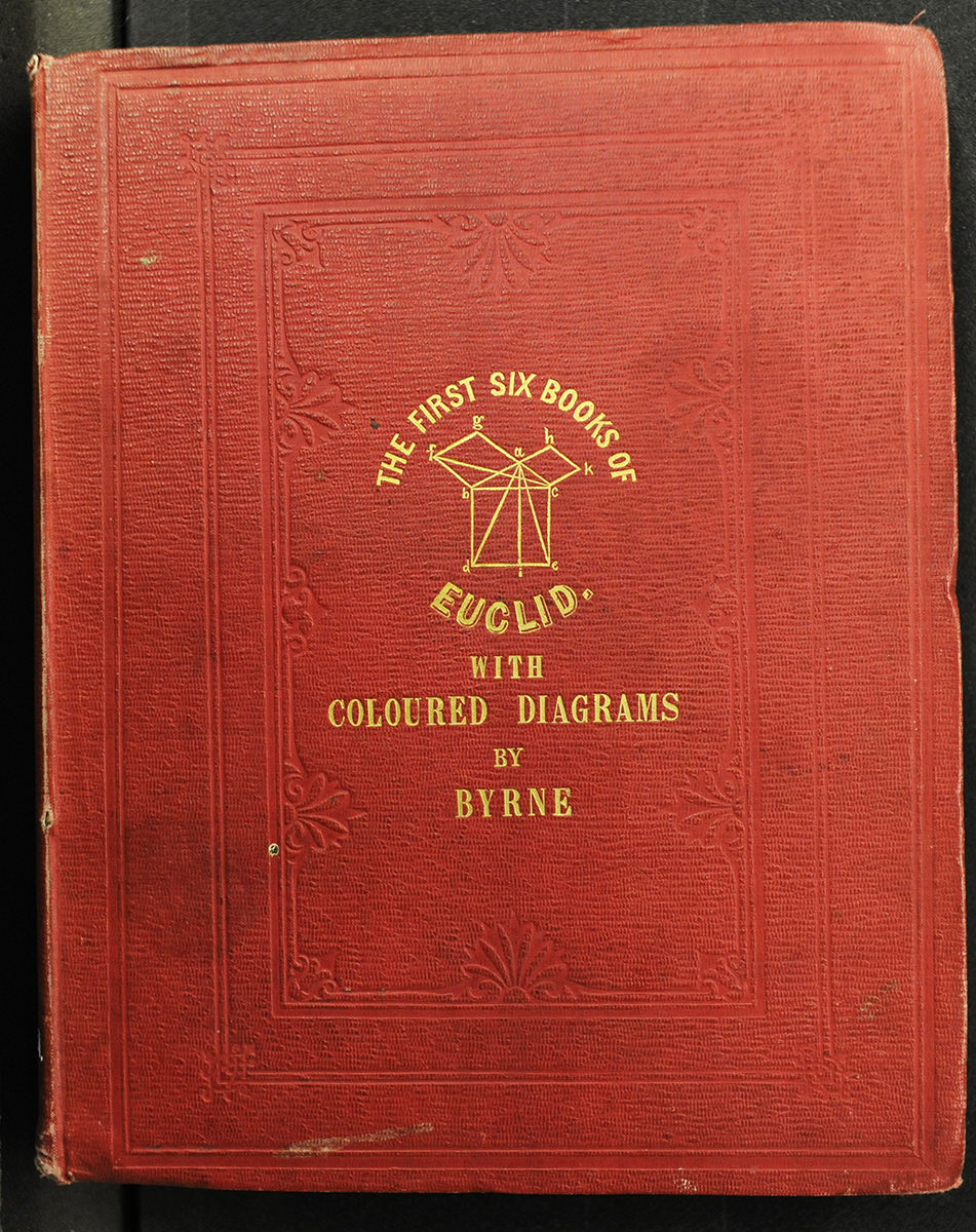
However, Euclid has been on my mind lately; partly because in mid-October I mined our stacks for editions of Euclid for #WorldMathsDay on Twitter, and partly because we currently have an intern that is wrapping up full-level cataloguing of the Mackay Collection. During that mid-October stroll down our editions of Euclid, I came across our copy of Oliver Byrne’s 1847 edition of the first six books of the Elements, advertised “in which coloured diagrams and symbols are used instead of letters for the greater ease of the learners.” This book floored me when I first opened it back in October, so it is now that we turn to it again for a closer look.
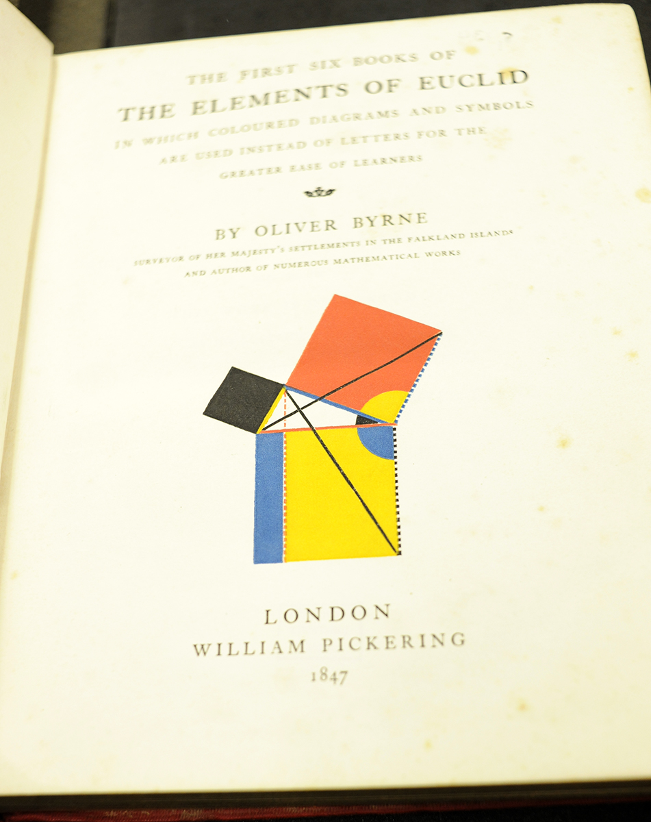
This edition of Euclid, to the modern reader, is a richly saturated, tri-tone experiment in explaining the complexities of the foundations of geometry through shape and colour. Although Byrne, in his introduction, states that “this work has a greater aim than mere illustration; we do not introduce colours for the purpose of entertainment, or to amuse by certain combinations of tint and form, but to assist the mind in its researches after truth…”one can’t help but conjuring up Mondrian paintings, or Bauhaus and De Stijl schools of design, Miami sky-scrapers. Only Byrne was working in the 1840s, not the 1910s and 20s!
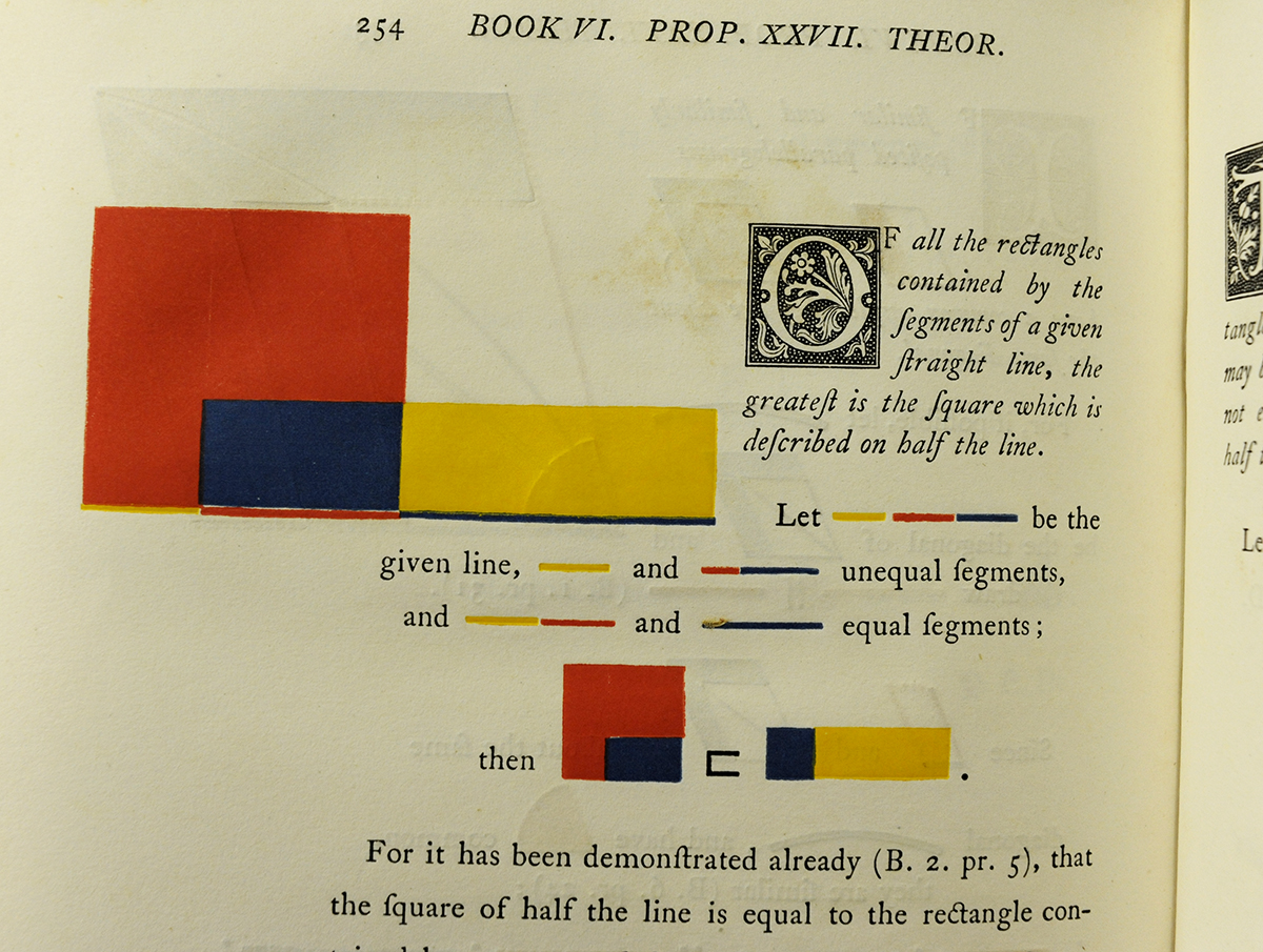
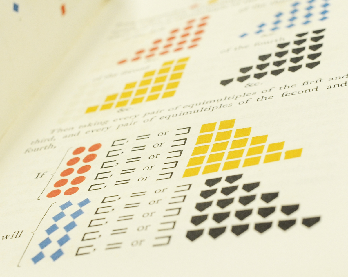

Oliver Byrne’s goal of making Euclid more democratically accessible by reducing complex problems and propositions to colours, shapes and lines, wasn’t received as well as the publisher, William Pickering, would have hoped, with over 75% of printed copies being counted as remainders in 1853. However, the gorgeous printing and layout by the Chiswick Press elevated the book above a mere mathematical text book and brought the Renaissance simplicity of artistic proportion and liveliness back to geometry. Byrne’s Euclid was so beautiful that it was one of a very small selection of books displayed at the Great Exhibition of 1851.
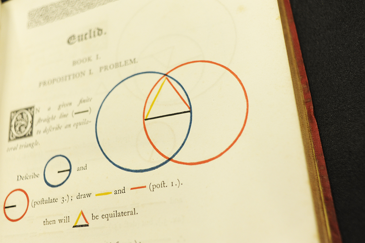
In order to understand some of the simplicity of Byrne’s ideas of using shape and colour, Sean Rippington, our Digital Archives Officer, has put together a few animated gifs for illustration on how Byrne’s methods worked:
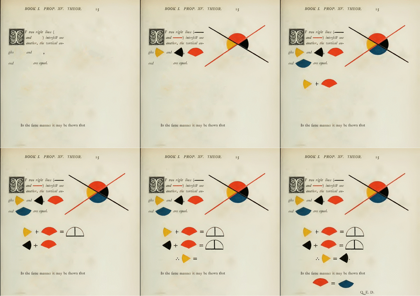
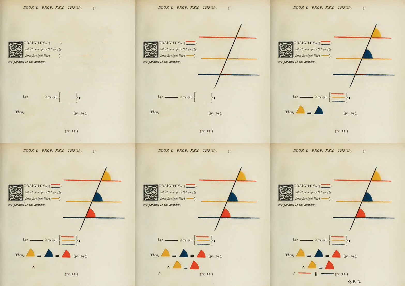
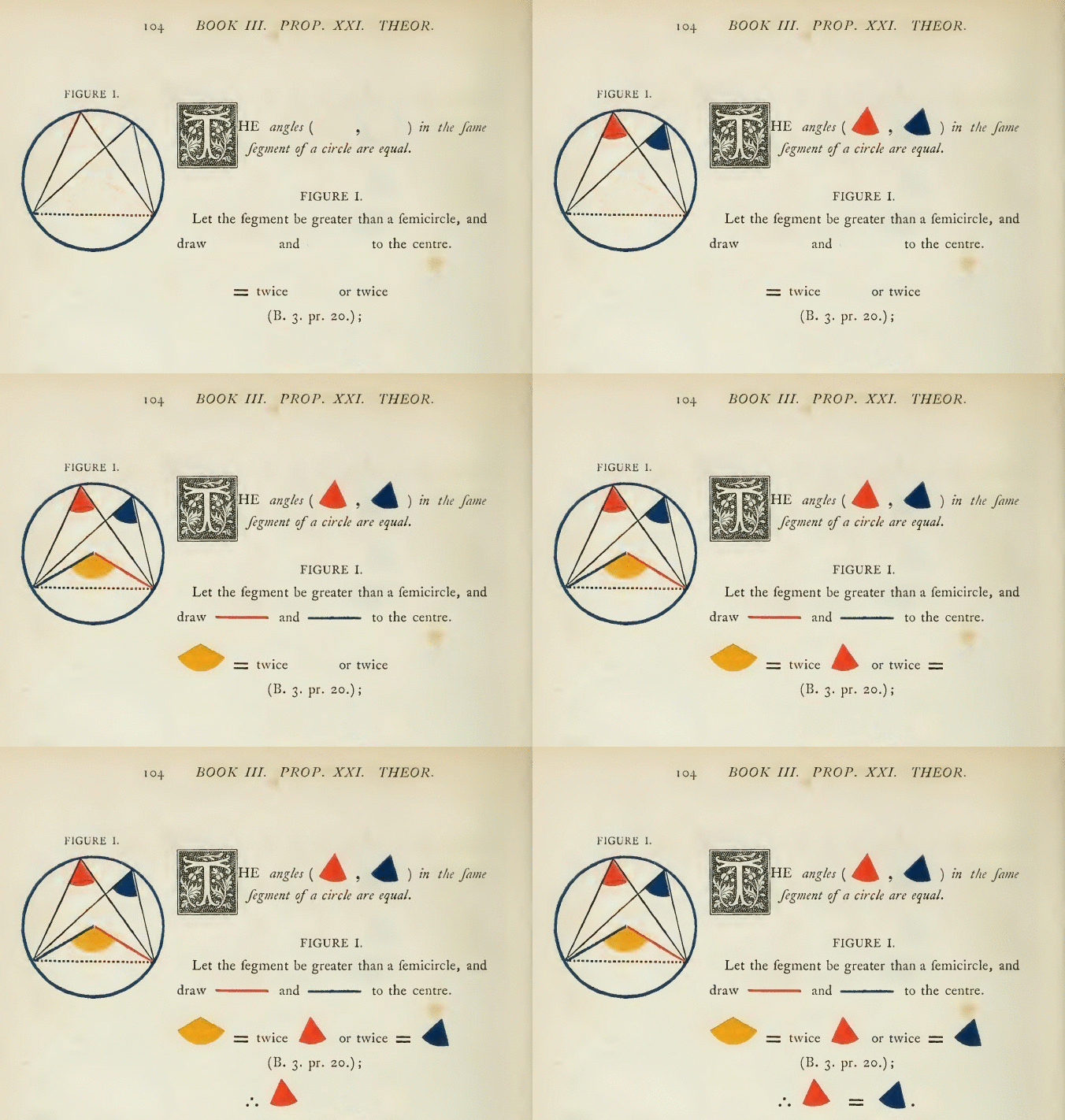
Whatever Byrne’s intention was, the modernity of his methods of illustration are striking. Ruari McLean, in his book Victorian book design & colour printing (Faber & Faber, 1963) rightfully calls the book “one of the oddest and most beautiful books of the century.” The layout of the book, its clear, humanist type, its decorated initials all echo the gorgeous productions of Baskerville and the Foulis Press of the 18th century, but the illustrations belong to the design schools of the 1920s. In this way, Byrne’s Euclid acts as an unconscious bridge between the aesthetics of the past and the future.
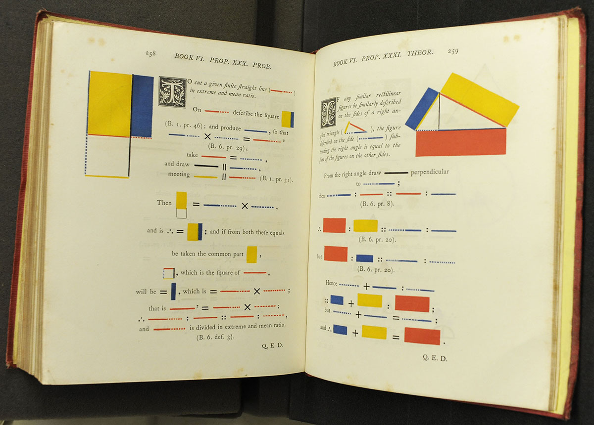
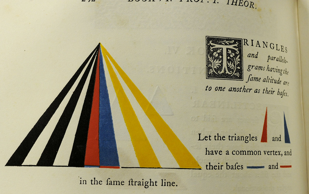
This edition of Euclid has gained new interest in the 21st century. A facsimile edition by Taschen has recently been produced and his influence on math education and on design is being revisited. Byrne’s edition of Euclid is a stunning example of 19th century innovation inspired by the needs of education, and his work should proudly sit on the shelves of any modern mathematician or designer. However, if your library doesn’t have an original of the 1847 edition, or you can’t afford the Taschen facsimile, you can freely download a hi-res pdf of the entire book here, thanks to the University of Toronto.
–Daryl Green
Rare Books Librarian
I like the version in the Bodleian http://treasures.bodleian.ox.ac.uk/The-Elements-of-Euclid
'Math'? Amercanism?
Hi James, the author, Daryl Green, is American hence the 'Math' rather than maths. Thanks for your comment.
Thank you.
[…] Amongst the stacks in St Andrews one can find some of the most stunning and renowned examples of mathematicians and artists collaborating or crossing boundaries to experiment largely with Euclid’s Elements and their complex problems, theorems and solutions: Luca Pacioli’s edition of Euclid and his collaboration with da Vinci in his Divina proportione, Apollonius’s Conics,… […]
[…] Byrne employed the colour scheme for the figures and diagrams in his most unusual 1847 edition of Euclid’s Elements in which coloured diagrams and symbols are used instead of letters. This example of Victorian […]