Titles on books are important, as they tell us what to find inside without opening the covers. Most often these are found on the spine; after all, this is the part of the book visible on the shelf. But they can also be found on the front cover. In the early days of cloth bindings, titles were printed on a paper label which was affixed to the front cover or to the head of the spine.
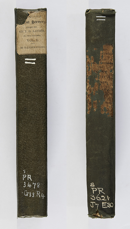
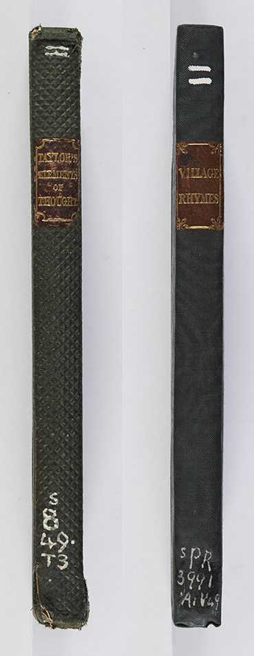
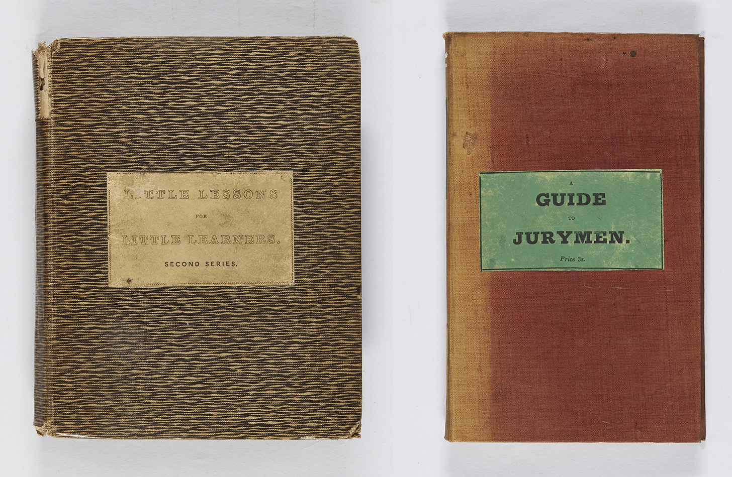
Some examples of paper spine labels, both showing how easily they can rub away. William Gilpin, Remarks on forest scenery, and other woodland views, 2 vol. (Edinburgh: Fraser and Co., 1834), s PR3478.G33R4 ; A. Pope, The poetical works of Alexander Pope (London: Jones and Co., 1830), s PR3621.J7E30.Less infrequently leather spine labels were used, with the title of the work blocked in gilt. Isaac Taylor, Elements of thought (London: Holdsworth and Ball, 1834), s B49.T3 ; Village rhymes (London: R.B. Seeley and W. Burnside, 1831), s PR3991. A1V494.Two examples of paper labels on the front cover. Mrs. Barwell, Little lessons for little learners (London: Frederick Westley and A.H. Davis, 1835), Chi PZ6.B37 ; The juror’s guide, or the spirit of the jury laws (London: T. Hurst, 1833), s KB57.J8B3.
With the invention of blocking, titles could be applied directly to the cloth, although William Pickering, a publisher active until his death in 1854, chose the more conservative paper spine label on works published in plain cloth, a style adopted by several other small publishers of the period, such as D.A. Talboys and Francis Macpherson.
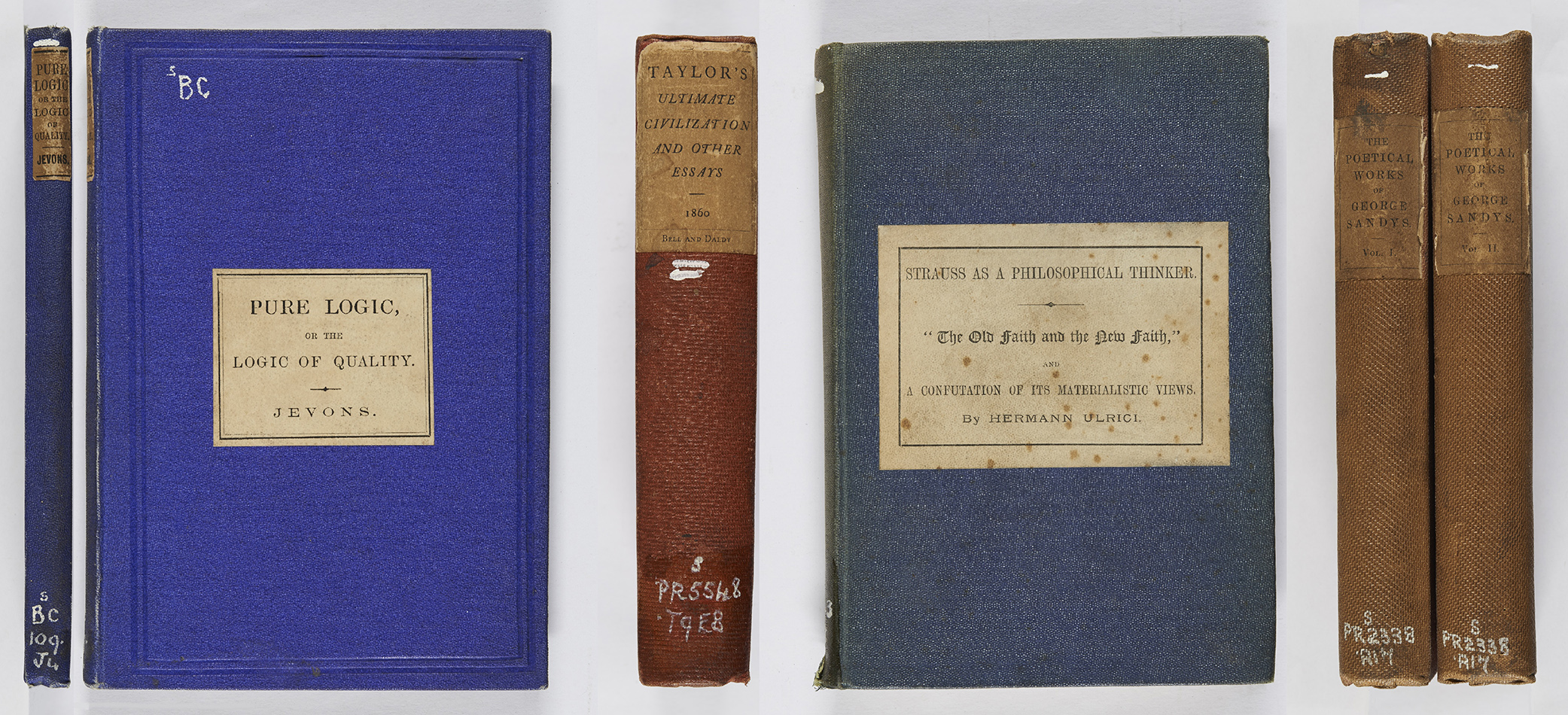
These publishers preferred the more conservative paper label for the title. W. Stanley Jevons, Pure logic (London: Edward Stanford, 1864), r BC109.J4 ; Isaac Taylor, Ultimate civilization and other essays (London: Bell and Daldy, 1860), s PR5548.T9E8 ; Hermann Ulrici, Strauss as a philosophical thinker (Edinburgh: T. & T. Clark, 1874), r B3343.U5 ; George Sandys, The poetical works of George Sandys, 2 vol. (London, John Russell Smith, 1872), r PR2338.A17.
Titles were originally lettered in clear fonts, and as we saw earlier in this series could be surrounded by a frame when on the spine.
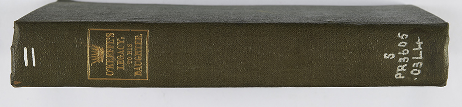
An example of a clearly-lettered spine title, with a simple line frame. J. O’Keeffe, O’Keeffe’s legacy to his daughter, being the poetical works of the late John O’Keeffe (London: G. Whittaker and Co., 1834), s PR3605.O3L4.
The 1860s, however, saw the introduction of varied lettering, some so stylised that it could be difficult to read the actual words. The worst were perhaps those done in the gothic style, but other designs include rustic lettering imitating tree branches.
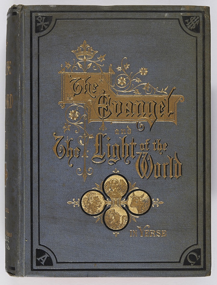
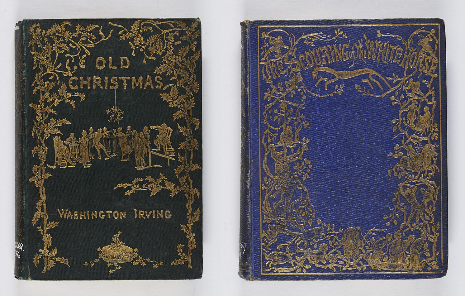
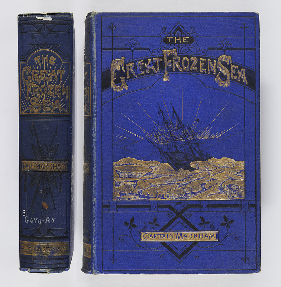
Briony says: Okay, I’m cheating a little with this one, it being an American publication, but it’s a good example of gothic lettering. Abraham Coles, The life and teachings of our Lord in verse (New York: D. Appleton and Company, 1885), r BT302.C6.The lettering on these bindings imitate branches. Irving Washington, Old Christmas (London: Macmillan & Co., 1876 ; bound by Burn & Co.), r PS2069.C4E76 ; Thomas Hughes, The scouring of the white horse (Cambridge: Macmillan and Co., 1859), s PR4809.H8S3.Here we have lettering imitating icicles, complementing the title of the work. A.H. Markham, The great frozen sea: a personal narrative of the voyage of the “Alert” during the Arctic expedition of 1875-6 (London: Daldy, Isbister & Co., 1878), r G670.A5.
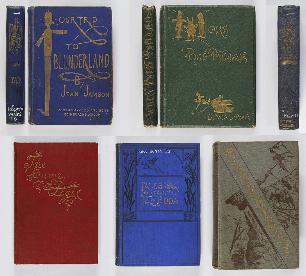
Further examples of stylised writing, some being very tricky to read! Jean Jambon, Our trip to Blunderland (Edinburgh and London: William Blackwood and Sons, 1877), Chi PR4970.M152T8 ; W.S. Gilbert, More “Bab” ballads (London: George Routledge and Sons, [1873?]), Chi PR4713.M6 ; Robert Swinhoe, Narrative of the North China campaign of 1860 (London: Smith, Elder and Co., 1861), r DS760.S8 ; Lewis Carroll, The game of logic (London: Macmillan and Co., 1887), Chi BC79.C3 ; Helen Zimmern, Tales from the Edda (London: W. Swan Sonnenschein & Co., ca. 1884), Bev BL865.Z5 ; Archibald R. Colquhoun, Across Chrysê, 2 vol. (London: Sampson Low, Marston, Searle, and Rivington, 1883), r DS709.C7.Further developments began in the following decade. One was the practice of reverse blocking the title on gold ribbons, the ribbons often being diagonal rather than horizontal.
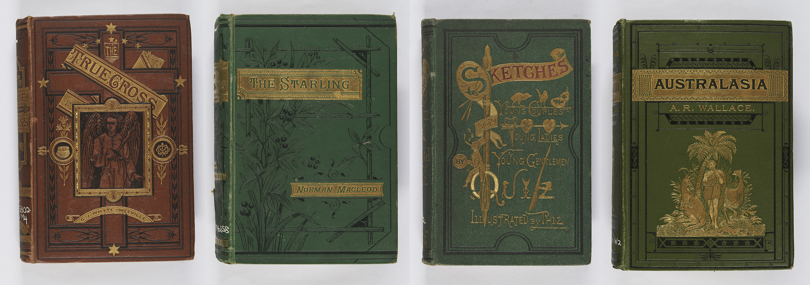
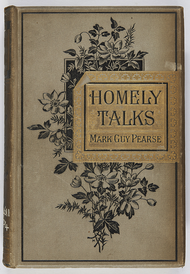
Examples of titles on gold ribbons. G. J. Whyte-Melville, The true cross: a legend of the church (London: Chapman and Hall, 1873), r PR5802.M4 ; Norman Macleod, The starling: a Scotch story (London: Wm. Isbister Limited, 1881), r PR4971.M66S8 ; Charles Dickens, Sketches of young couples, young ladies, young gentlemen (London, New York: Cassell, Petter, and Galpin, 1869), r PR4572.S5 ; Australasia (London: Edward Stanford, 1880), r GB381.W2.Briony says: I particularly like this example, where the ribbon has been blocked as if a corner has been folded over. (BH) Mark Guy Pearse, Homely talks (London: Wesleyan Conference Office, 1881), r BV4611.P4.
Another development was the practice of heightening the initial letter of a word or words in the title, either by added background colour or the use of a gold initial with the other letters in black (or vice versa). Alternatively initials could be floriated, sprigged, or scrolled.
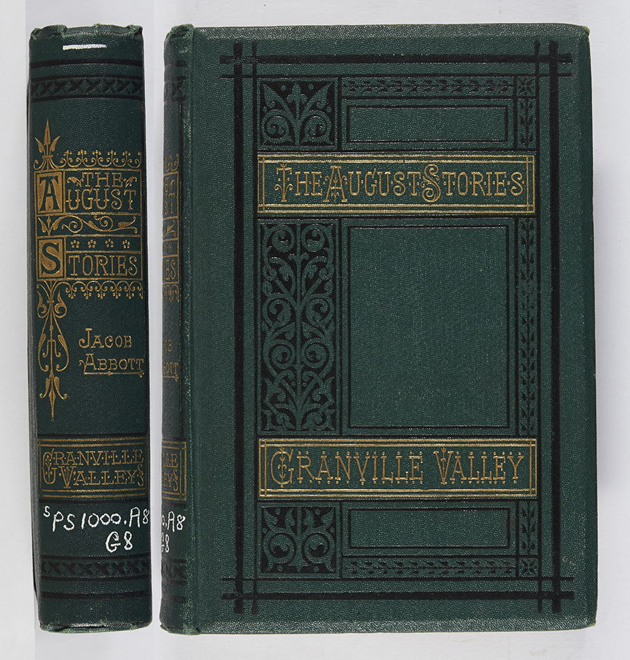
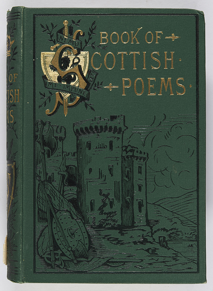
The initials on the spine have been highlighted by being on a gold background, whilst those on the cover are sprigged. Jacob Abbott, Granville Valley (London: Strahan & Co., 1873), Chi PS1000.A8G8.On this binding a shield has been used to highlight the letter ‘s’ in the title. The book of Scottish poems ancient and modern (Edinburgh: Edinburgh Publishing Company, 1884), r PR8648.R8.
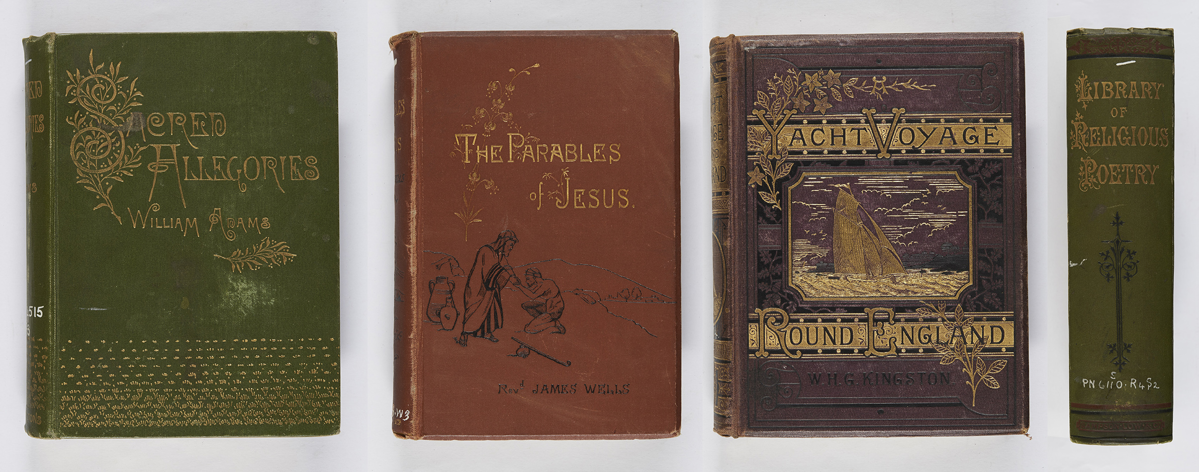
Examples of sprigged and floriated initials. William Adams, Sacred allegories (London: Rivingtons, 1885), r BV4515.A3 ; James Wells, The parables of Jesus (London: James Nisbet & Vo., 1884), r BT376.W3 ; William H.G. Kingston, A yacht voyage round England (London: Religious Tract Society, [1879]), Chi GV814.K5 ; A library of religious poetry (London: Sampson Low, Marston, Searle, and Rivington, 1883), r PN6110.R4S2.Titles, which began as a means of identifying the work, had now become an integral part of the binding’s design.