Illustrating Austen at 200
To mark the 200th anniversary of the death of Jane Austen on 18 July 1817, we have a blog from a member of teaching staff in English who frequently brings her classes to use Special Collections material.
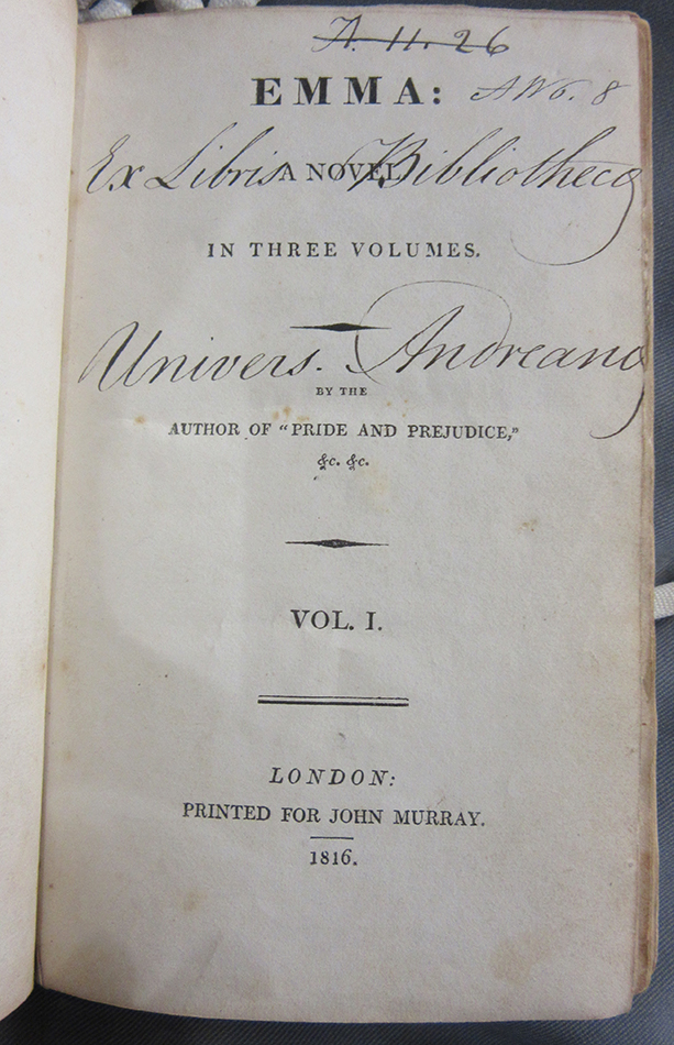

Given the current unrelenting enthusiasm for all things Jane Austen worldwide, it is easy to forget that none of her novels sold out on first publication. Emma (1815) was Austen’s ‘most successful book (in terms of sales)’ in her lifetime, with just over a quarter of the 2,000 print run remaining unsold in 1818.[1] St Andrews holds one of these original, three-volume editions, along with the first edition of Northanger Abbey: and Persuasion. (1818), published together six months after Austen’s death with a ‘Biographical Notice of the Author’ by her brother Henry, attaching her name to her novels for the first time. Austen was highly respected by her Romantic contemporaries – foremost by Sir Walter Scott, who recognised her extraordinary ability to represent the ‘current of ordinary life’, but also by fellow female writers Maria Edgeworth and Mary Russell Mitford. Yet even so, her popularity with an increasingly vast body of readers after her death was fuelled by the efforts of Victorian publishers offering increasingly decorative editions of the novels throughout the nineteenth century. The Victorians read Austen and fell in love with her characters in nineteenth-century editions punctuated by illustrations that literally put new frames around them.
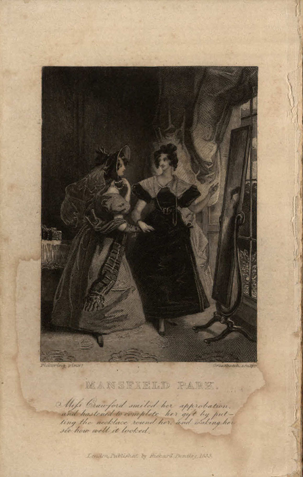
Unsurprisingly, the first step in building Austen’s posthumous readership and reputation was to make her novels available to readers in affordable editions. In 1830 the London publisher Richard Bentley set out to do exactly that, including Austen’s novels in his ambitious ‘Standard Novels’ series and placing her alongside a recent new edition of Mary Shelley’s Frankenstein (1831) as well as works by Maria Edgeworth, Frances Burney, and William Godwin in a list that eventually swelled to over 120 titles. The library holds a complete set of Bentley’s resulting editions, published in 1833 and also the first Austen novels to be illustrated by means of a full page frontispiece and a vignette on the title page for each volume. After many years of misidentification, Devoney Looser has recently identified the artist as Ferdinand Pickering, who worked on many other titles for Bentley in the Standard Novels series.[2]

A much later 10-volume The Novels of Jane Austen published by Chatto and Windus in 1908, produced with rather lush green covers and illustrated by the Punch cartoonist Arthur Wallis Mills (1878-1940), is also in the Library’s collection, and has not attracted much critical attention from Austen scholars, having been rather overshadowed by the endeavours of earlier illustrators Hugh Thomson and brothers Charles and Henry Brock at the end of the nineteenth century. In many ways this is right, as both Thomson and the Brock Brothers moved Austen illustration forward in tangible ways: Thomson’s famous designs for Pride and Prejudice (1894), with its striking gold-embossed peacock cover and 160 individual illustrations, visualised the novel on a new scale, while Brock brothers’ Austen illustrations were the first to appear in colour in 1898.[3] Arriving ten years later, Wallis Mills’s bright colour illustrations for Chatto and Windus cannot make the same claims for innovation, but their entertaining designs nevertheless demonstrate how the experience and style of the illustrator could alter the texture and tone of the novels.
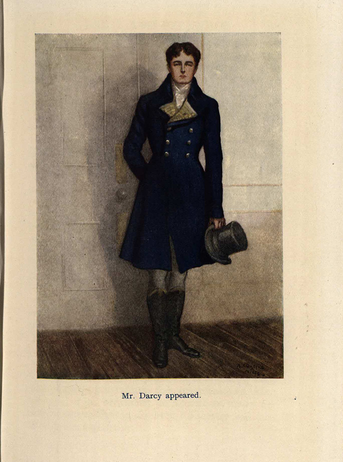
Despite R. Brimley Johnson’s assessment in the introduction to the Pride and Prejudice volume in the Chatto and Windus series that Austen’s ‘men are perfectly real, quite manly, and admirably varied, but they are not drawn with intimate knowledge’, Wallis Mills seems to have been particularly interested in picturing her male characters, and gratifies readers’ curiosity by means of a full-length portrait of Mr Darcy. Austen’s first description of Darcy as
‘a fine, tall person, handsome features, noble mien’,
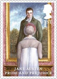
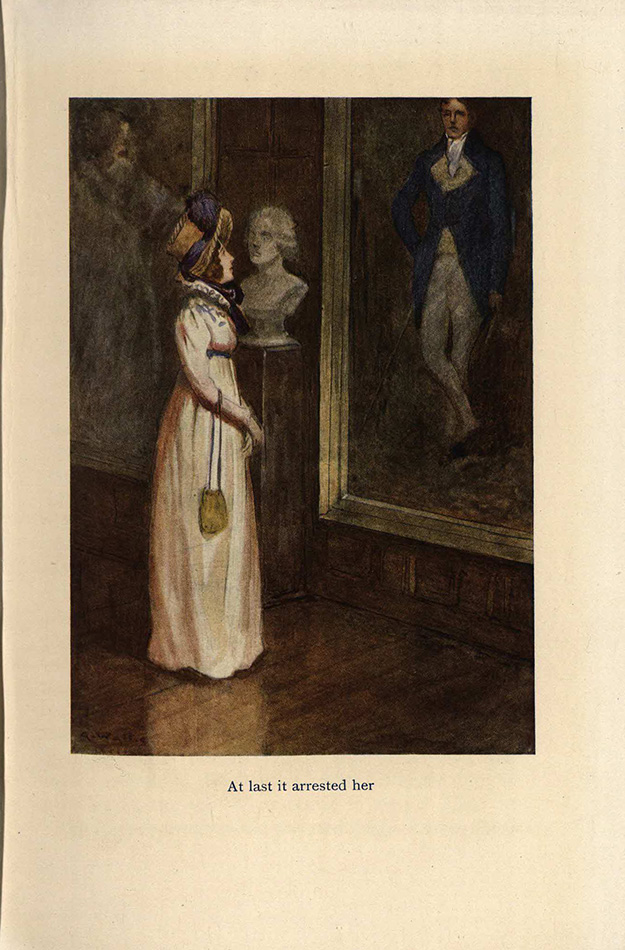
offers no material clues about his colouring or clothing – leaving the artist free to depict his subject as he saw fit. Darcy reappears in Wallis Mills’s illustration of Elizabeth admiring his portrait at Pemberley, drawing attention to the same scene chosen more recently to represent the novel in the set of commemorative stamps produced for its 200th anniversary in 2013.
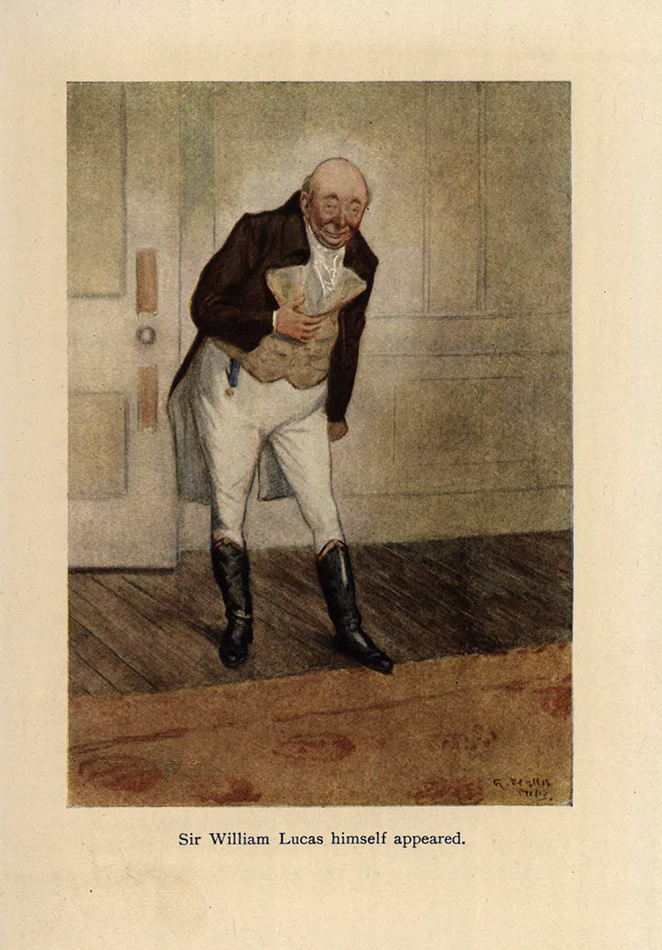
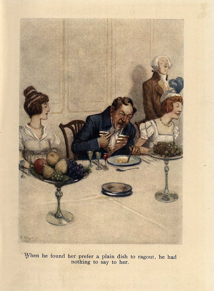
As might be expected from a former Punch cartoonist, Wallis Mills applies his caricaturist’s eye to other men of the novel more openly mocked by Austen for their inflated views or poor manners. His profile of the Bennets’ neighbour Sir William Lucas captures the newly-made knight’s sycophantic interest in upward mobility and gushing admiration for the manners of ‘polished societies’ by depicting him mid-bow with a beaming smile and rosy cheeks. Wallis Mills also creates a moment of physical comedy in his unflattering portrait of Mr Hurst, Mr Bingley’s brother-in-law, pictured exhibiting the behaviour of an outright glutton when seated next to Elizabeth at dinner. This is a clear exaggeration of Austen’s quieter but perhaps no less cutting description of Mr Hurst as ‘an indolent man, who lived only to eat, drink and play at cards’, and well demonstrates how illustration could exaggerate Austen’s humour. As Looser has put it, ‘book illustration helped make the author a different Jane Austen, her fiction a different kind of fiction’.[4]
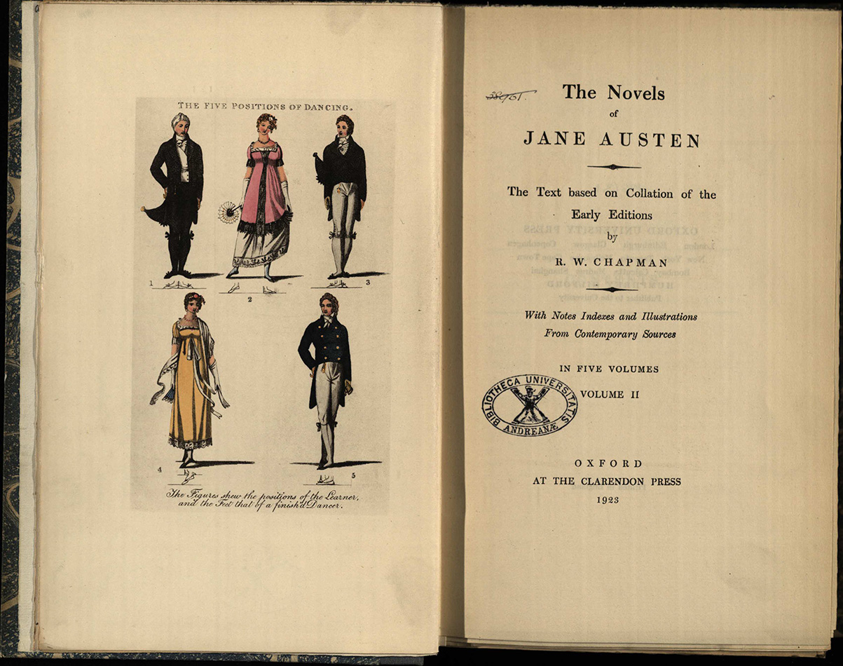
Developments in print technology and particularly colour printing made the lure of illustration difficult to resist at the beginning of the twentieth century, not only for publishers like Chatto and Windus looking to boost sales, but for Austen scholars as well. R. W. Chapman, editor of the first scholarly edition of Austen’s novels for Clarendon Press and a St Andrews graduate (MA, 1902 with First class honours in Classics), chose to illustrate his volumes with coloured fashion advertisements from Romantic periodicals and magazines, as well as illustrations from Thomas Wilson’s An Analysis of Country Dancing (1808). Chapman was committed to placing Austen’s novels in their own times, offering detailed chronologies of the novels based on almanacs to prove how far Austen’s realism penetrated and that she ‘knew where she was even when she does not tell us’. So, it is not surprising that he also wanted to offer equally accurate illustrations of dancing positions and clothing, despite the fact that Austen rarely gives us extended technical descriptions of the dance moves performed at the balls and dances otherwise crucial to her plots, or describes the intricacies of her characters’ formal dress and headwear. Chapman’s collaborator J. Arthur Platt had been firmly against these kind of decorations, advising no pictures at all and damning the ‘miscreants who illustrate Jane Austen’ to their own ‘special bolgia […] in the next world.’ [5] While decidedly anti-illustration, Platt’s scathing comment nevertheless recognises the power of pictures to alter how we read Austen and visualize her world.
Dr Katie Garner
School of English
[1] Claire Harman, Jane’s Fame: How Jane Austen Conquered the World (Edinburgh: Canongate, 2009), p. 99.
[2] Devoney Looser, The Making of Jane Austen (Baltimore: Johns Hopkins University Press, 2017).
[3] Looser, The Making of Jane Austen, p. 61.
[4] Looser, The Making of Jane Austen, p. 69.
[5] J. Arthur Platt to Robert Chapman, Bodleian MS. Eng. Misc. c. 924, ff. 31-2, quoted in Kathryn Sutherland, Jane Austen’s Textual Lives: From Aeschylus to Bollywood (Oxford: Oxford University Press, 2005), p. 32.