The St Andrews Qur’an Part Two: Deconstructing a Frontispiece, Mapping an Insert
This week we have a follow-up post by Dr. Keelan Overton, a Library Special Collections Visiting Scholar in 2016 who returned to St Andrews in May 2018 as a Visiting Fellow in the Centre for Anatolian and East Mediterranean Studies.
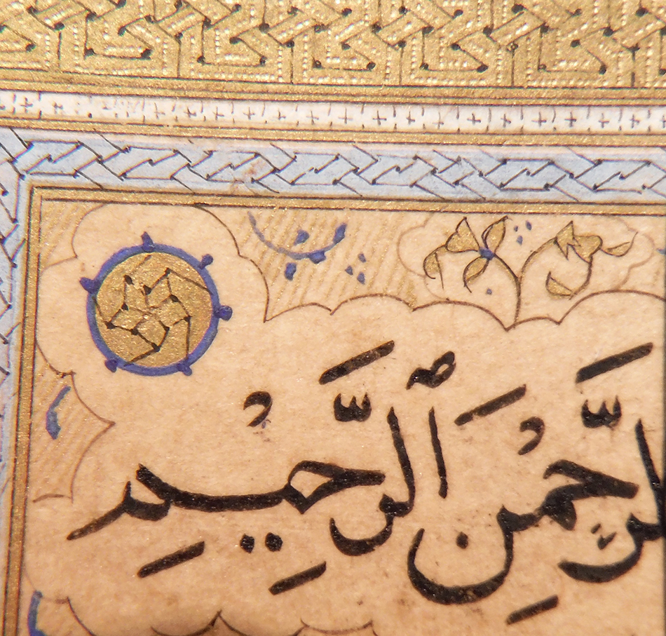
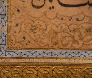
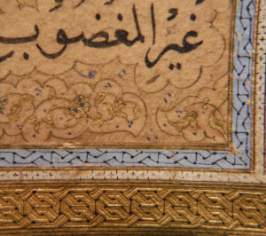
At the end of my first blog on the single-volume Qur’an preserved in the University of St Andrews Library Special Collections, I hinted at a series of discrepancies caught by tired eyes on the last day of my 2016 residency. While comparing the text panels of the manuscript’s double-page illuminated frontispiece, each comprised of six lines of naskh (figs. 1-2), I noticed differences in the layout of the calligraphy (balanced on the right; four cramped lines on the left), orthography (a slightly more angular and compact hand on the right), verse markers (textured gold outlined in shaky blue on the right; flat and smooth on the left), and background drawing (abraded gold and minimal blue on the right; far better condition on the left) (figs. 3-6). What explained these differences? Were the two pages not a cohesive pair, as typically presumed?
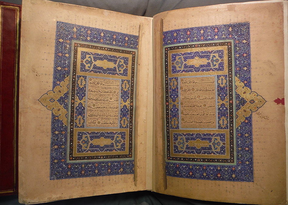
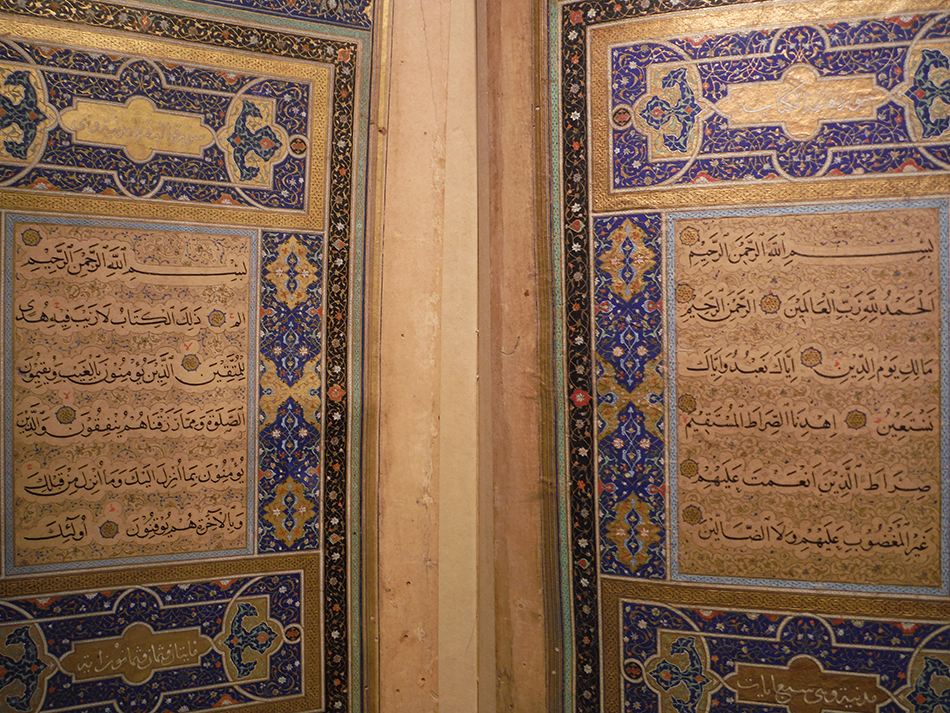
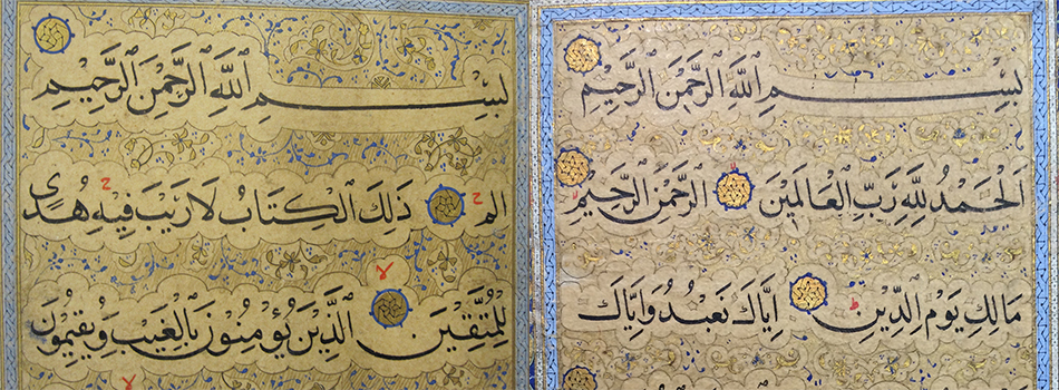
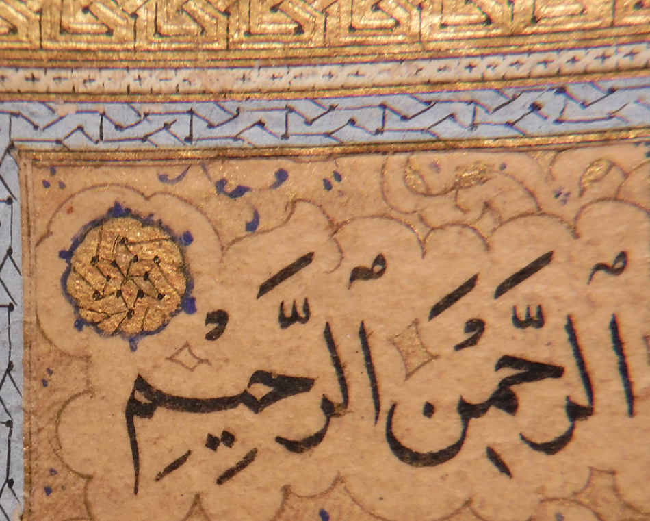
In May, I returned to St Andrews to continue studying the manuscript and was delighted to reunite with collaborator Kristine Rose-Beers, a Senior Conservator at the Chester Beatty Library, with whom I had shared the 2016 residency. One of our goals was to readdress the perplexing frontispiece and to triple-check some hypotheses. Following our residency, Kristine had proposed that the majority of the illuminated field on the right was probably an insert (a separate sheet of paper adhered to the surface of the larger host folio) in the form of a rectangle (fig. 7). Kristine’s hypothesis helped to explain the discrepancies that I had observed between the text panels, and I thus developed the following theory: the illuminated field on the right once existed as precious historical “salvage” in the workshop, and despite the fact that it has suffered some tears, it was selected for insertion into the present folio 1 of the St Andrews Qur’an (examples of comparable recycling are known in other manuscripts). The left page was made to match, and this explains its far better condition, among many other differences.
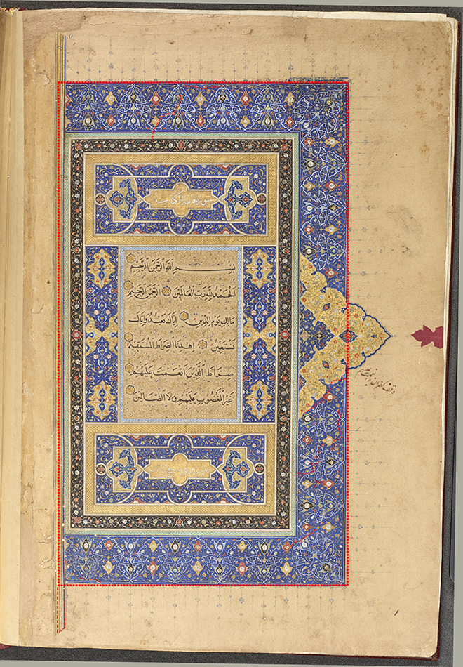
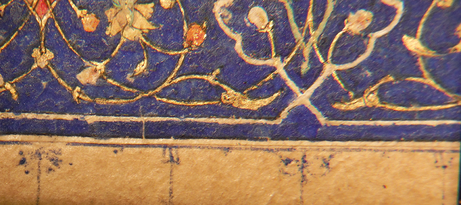
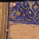
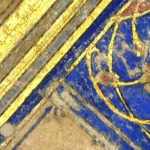
During our reunion in May, we utilized a variety of tools to confirm that the insert is indeed a perfect rectangle. Beginning in the lower left, the corner of the inserted piece of paper is clear (figs. 8-9). The left edge is located within the thick blue ruling, while the lower edge is marked by a thin blue line. As we move to the right, this blue line transfers to the host folio underneath (fig. 10). In the lower right, the corner of the insert is again abundantly clear (fig. 11), and continuing upwards, the seam runs directly through the anse (the gold triangular form projecting into the margin). Mapping the upper edge of the insert is slightly more difficult, given off-set (or transfer) of the blue ink from the facing page and a slightly different technique of insertion (discussed further in print) (fig. 12).
- Figure 8
- Figure 9
Figs. 8-9. Right page insert: the lower left corner. In fig. 8, black lines indicate the edges of the insert. Fig. 9 was taken with a Dino-Lite and provides an alternative view. (Overton, 2018)
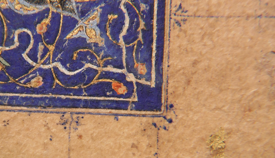
While our hypothesis of a rectangular insert was confirmed, there was yet another twist, as has been common with this manuscript. Additional examination of the right text panel revealed that it is also an insert; in this case, in the form of a smaller “nested” rectangle (figs. 13-14). Along some edges, great care was taken to mask the seam by continuing the streaks of gold decorating the background (fig. 15). The right page of the illuminated frontispiece is thus an insert within an insert. Conundrum indeed.
- Figure 13
- Figure 14
- Figure 15
Figs. 13-15. Right page text panel: the lower edges of the insert. Figs. 14-15 are of the same corner; compare raw photography with a Dino-Lite. (Overton, 2018).
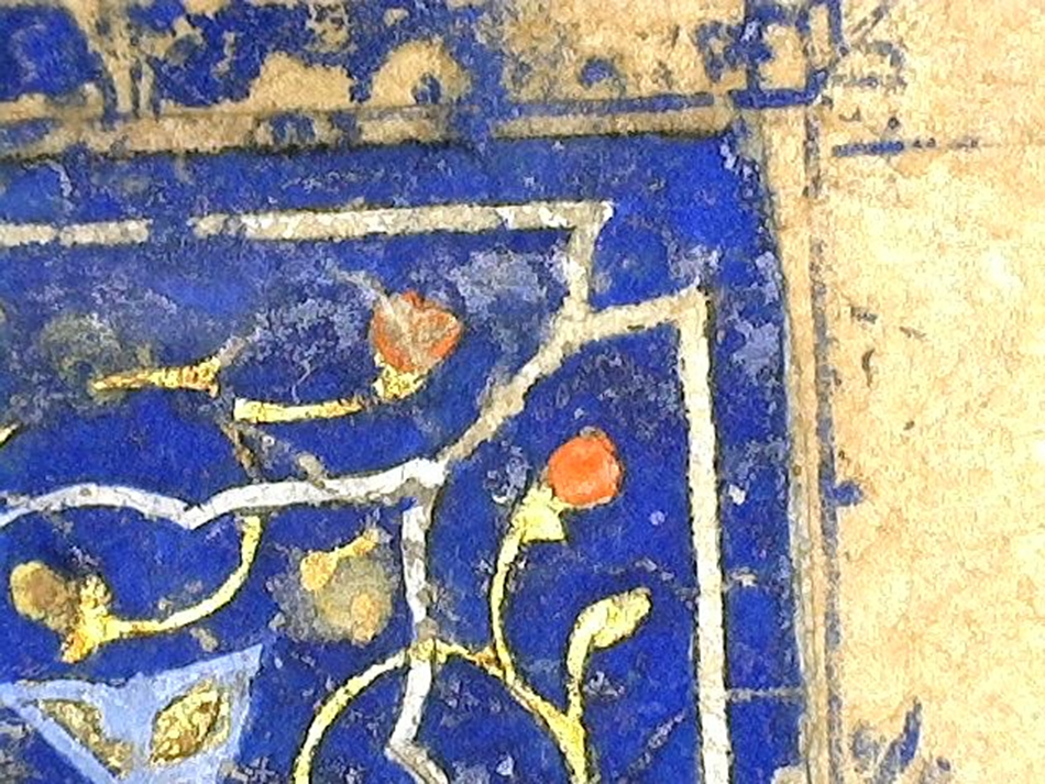
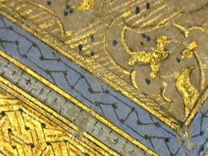
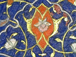
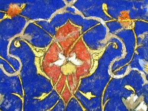
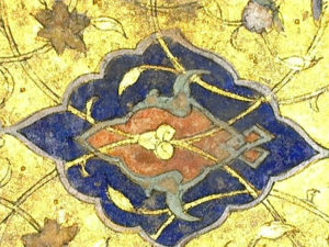
Our analysis in May also focused on comparing the illumination between the two pages, which is dominated by ultramarine blue and painted shell gold and is exemplary in design and execution. Although the illumination appeared similar on first glance, sustained scrutiny with a variety of tools in different lighting conditions revealed significant differences in pigment, pattern, surface, and condition (figs. 16-21).
- Figure 17
- Figure 16
Figs. 16-17. Comparison of a motif from the outer blue border of each page. On the right, the pigment is a true red. On the left, it is orange. (Overton, 2018, Dino-Lite)
- Figure 19
- Figure 18
Figs. 18-19. Comparison of a motif from each anse. On the right, we again note a true red, as well as the seam running through the anse. (Overton, 2018, Dino-Lite)
- Figure 21
- Figure 20
Figs. 20-21. Comparison of the gold on each page in raking light. Note differences in tone (a warm bronze on the right; yellow and green on the left), planar distortion (more prominent on the right), and surface treatment (pricking on the left).
Despite all of these differences, the workshop responsible for matching the right and left pages was extremely successful in creating the illusion of a cohesive pair. Indeed, since the 1970s, the frontispiece has been lauded as the masterpiece spread in the codex. It remains a masterpiece, but just not in the conventional sense. Instead of being a seamless opening created in a single stage (e.g. Timurid, ca. 1500), it is a product of aggregation reflecting a variety of hands, techniques, and agendas. Far more complicated than presumed, it is a testament to both the calligrapher and illuminator responsible for the right side (again, an insert within an insert) and the later workshop that meticulously integrated this “salvage” into the present folio and effectively “copied” it on the left. But why go to all the trouble, and what does this reveal about workshop practices? Where and why the frontispiece was paired as such is addressed in our forthcoming article, as is its equally enigmatic relationship to the rest of the textblock (comprising 318 folios).
The structural complexity of the frontispiece is representative of the St Andrews Qur’an as a whole. We have conducted comparable technical analyses of the colophon, flyleaves, and binding, and this codicological research has illuminated how the manuscript was transformed and used over the course of three centuries in five distinct courtly contexts. For those of us who work on book culture in the late medieval and early modern Islamic world, the notion of a luxury manuscript changing hands across vast geographies and being physically altered along the way (e.g. new or revised paintings, illuminations, margins, ownership marks, colophons, glosses, bindings) is not necessarily surprising. To offer but a few examples, we can consider the Topkapi’s fourteenth-century Shirazi manuscript with three subsequent layers of intervention (see Priscilla Soucek and Filiz Çağman, chapter 10, in this volume), the Freer’s Gulistan copied in Herat in 873/1468-69 and later modified at the Mughal and Safavid courts, and many of the “manuscripts on the move” in the Freer’s 2016-17 Qur’an exhibition. For such coveted volumes, mobility and mutability typically hinged on their acquisition as military booty, selection as personal or state gifts, endowment as waqf, and/or recasting as cultural capital. Battle, diplomacy, and prestige likewise kept the St Andrews Qur’an on the move and ever changing. Indeed, who wouldn’t want such an exceptional book, and who wouldn’t want to leave a mark?
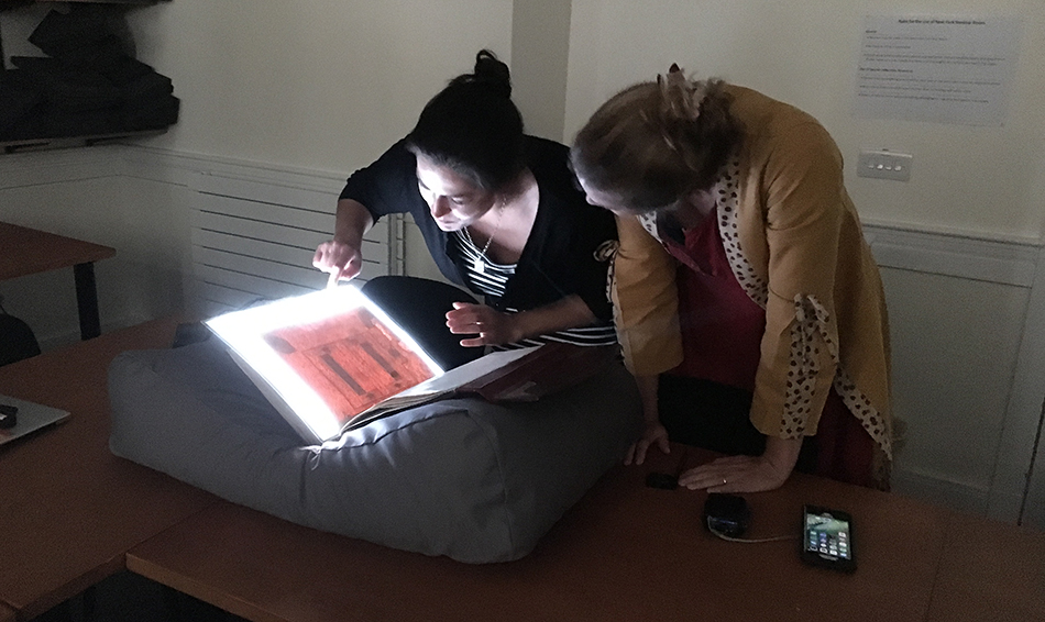
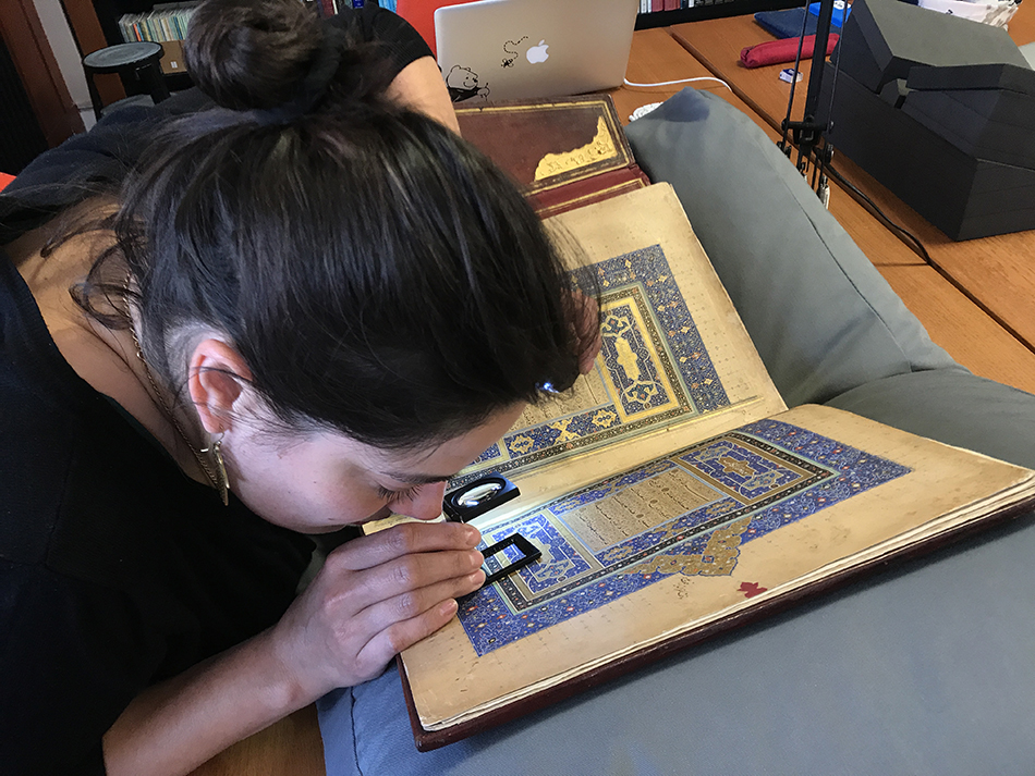
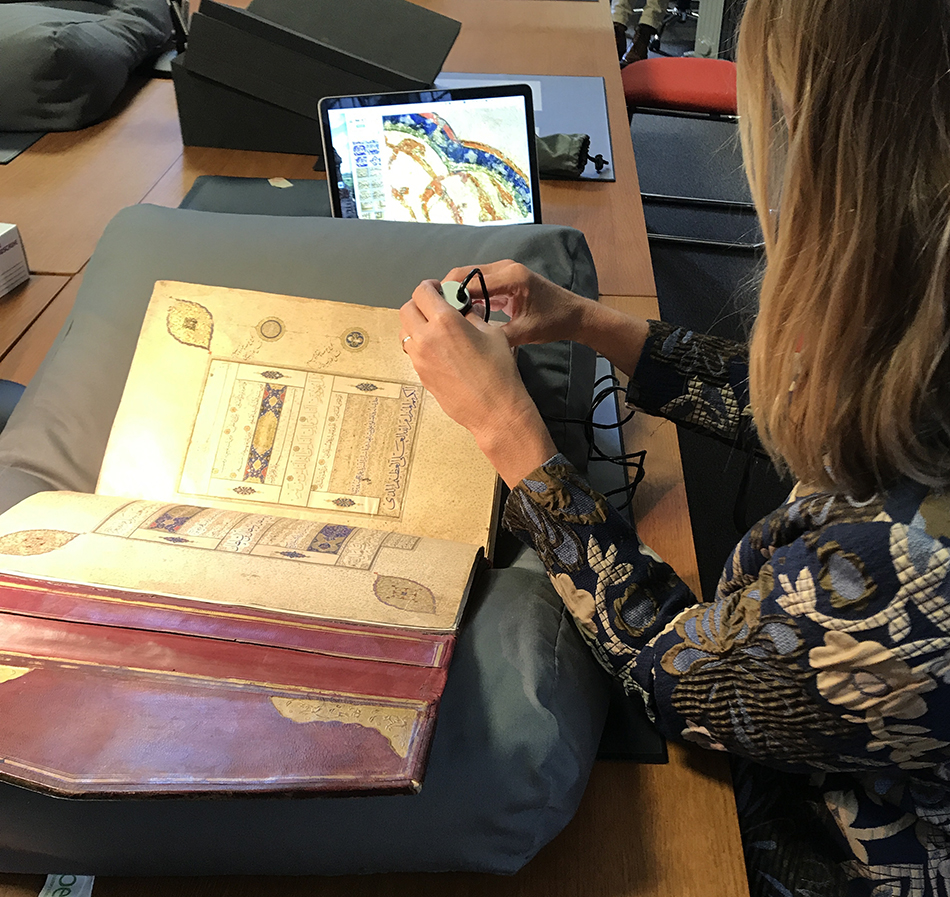
As we finalize our article on this complex codex, we ruminate on methodological challenges and revelations. Arguably the most resonant is the importance of sustained firsthand examination; not just two or three sessions, but more like 15+, and ideally staggered. We also appreciate the benefits and limitations of various tools of visual analysis, including the naked eye, raking light (figs. 20-21), a small magnifying lens (fig. 23), handheld flashlights/torches, light sheets (fig.22), high-resolution professional photography versus an iphone, powerful handheld microscopes like a Dino-Lite (fig. 24; I am grateful to Amanda Phillips for sharing her Dino-Lite and time on my last day), and multispectral imaging (explore techniques and equipment here). Depending on the need and question being asked, each of these tools was more or less valuable, thus necessitating the use of all of them. Finally, it is important to acknowledge technologies like this blog, which facilitate the sharing of images that might not otherwise be possible in print (too expensive, too detailed, too rough, too many). This online interface has allowed the images to speak for themselves and hopefully presented the frontispiece in a more textured, transparent, and informative light. Stay tuned for a possible Part Three…
Acknowledgments: I am indebted to Prof. Dimitri Kastritsis, Dr. Paul Churchill, and the Centre for Anatolian and East Mediterranean Studies (Department of History) for the opportunity to present on the St Andrews Qur’an at the “Imagined Geographies” workshop and for the visiting fellowship that secured this critical return. As always, I am grateful to the staff of Special Collections for their ongoing support, flexibility, and assistance, especially with unpredictable twists and turns. Last but not least, my sincerest thanks to Kristine for a “cracking” collaboration.
Dr. Keelan Overton
(sharing research conducted with Kristine Rose-Beers)
*Our article on the St Andrews Qur’an is forthcoming as follows:
Keelan Overton and Kristine Rose-Beers, with contributions by Bruce Wannell, “Indo-Persian Histories from the Object Out: the St Andrews Qur’an between Timurid, Safavid, Mughal, and Deccani worlds.” In Iran and the Deccan: Persianate Art, Culture, and Talent in Circulation, c. 1400-1700, edited by Keelan Overton. Bloomington, IN: Indiana University Press.
Additional online resources:
Chester Beatty Conservation blog, https://chesterbeattyconservation.wordpress.com
Asian and African studies blog, British Library, http://britishlibrary.typepad.co.uk/asian-and-african/
The Art of the Qur’an: Treasures from the Museum of Turkish and Islamic Arts, exhibition website, Freer|Sackler, http://archive.asia.si.edu/exhibitions/current/art-of-the-quran/default.php
[…] featured on the blog before, including the beautiful royal Qur’an from the early Safavid era, ms19(o), the Book of Wonders, ms32(o), the Bustan of Sadi, ms31(o) and the Shah Namah, ms28(o). This […]